Entagile: Four months learning a staffing business, and a site design built on what its buyers trust.

ThemeCredibility research
PlatformWeb
RoleProduct Design Intern — UX Research, UX Design, Framer Development
YearDec 2021 – Mar 2022
DirectorVictor Wang

Trust and credibility research for a financial staffing agency, and the site design and Framer build it produced.

My first US role was a 2021 design internship at a Fairfax financial staffing firm, where the founder hired me for the user research I was studying, not the design in my title. The assignment came as a question: what does a distrusted industry have to show before anyone believes it? Answering it taught me how an American team works.
Background

The first assignment was a question: what does a staffing firm have to show before people believe it?

My title was Product Design Intern, but Victor Wang, Entagile's founder, hired me for the user research I was studying as a graduate student in human factors psychology. He wanted the firm to read as a serious, professional operation, so the work started with research rather than a design brief.

Staffing is a category buyers approach warily. Many firms describe themselves in the same interchangeable language, so claims alone don't earn much trust. Entagile had substance, including engagements with Freddie Mac, Fannie Mae and Capital One and universities such as Johns Hopkins and the University of Maryland, but little of it was visible on the website.

The internship had two parts. First, I learned the business from the inside: sitting with the people who made placements, then interviewing the two audiences the firm serves. Second, I turned what I learned into a design for a five-page site (homepage, services, careers, blog and contact), which I later built in Framer.

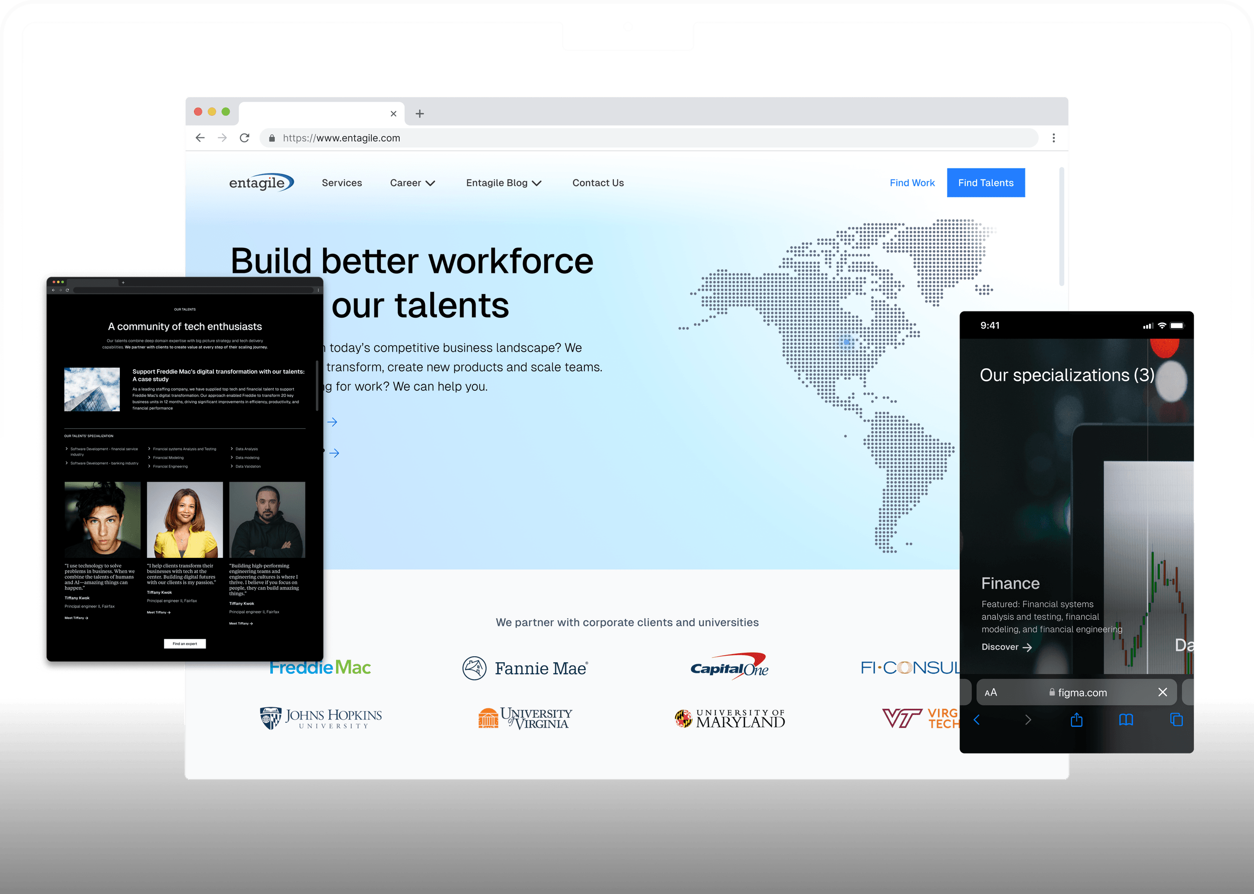
The Entagile site design I built in Framer, desktop and mobile.
Entagile marketing site on desktop and mobile

Research

Interviews showed that companies and candidates needed different evidence before trusting the firm.

I reviewed staffing and consulting sites, then ran 6+ interviews across both audiences, asking people what made them trust or discount a firm they were seeing for the first time.

Tone didn't persuade anyone. Specific information did: the firms placed with, the markets actually covered, real people attached to the work, and signs of ongoing expertise. Vague superlatives made interviewees more skeptical, not less.

The second finding was structural. Companies asked who do you work with? Candidates asked what's in it for me? Both were credibility questions, but each audience accepted different proof.

I presented both findings to stakeholders as the case for a dual-audience structure: one shared hero, two clear paths, each backed by its own evidence. As an intern, that was the first time I had to defend a structure using what the firm's own audiences said rather than my preference.

Design

A shared homepage with a separate path for companies and candidates.

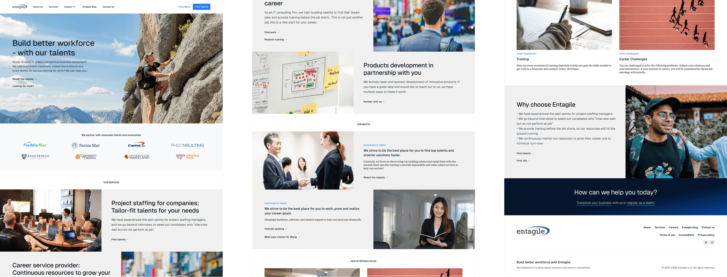
The proposed homepage opens with a shared value proposition, Build better workforce with our talents, then splits into "Reach the talents" for companies and "Launch my career" for candidates. A partner logo bar in the first scroll answers the company question directly.

Below that, service tracks and specialization areas give each audience a concrete next step, and a paired values section, Commitment to Clients alongside Commitment to Talents, repeats the two-path structure. The page ends with the blog, the firm's differentiators and a footer call to action.

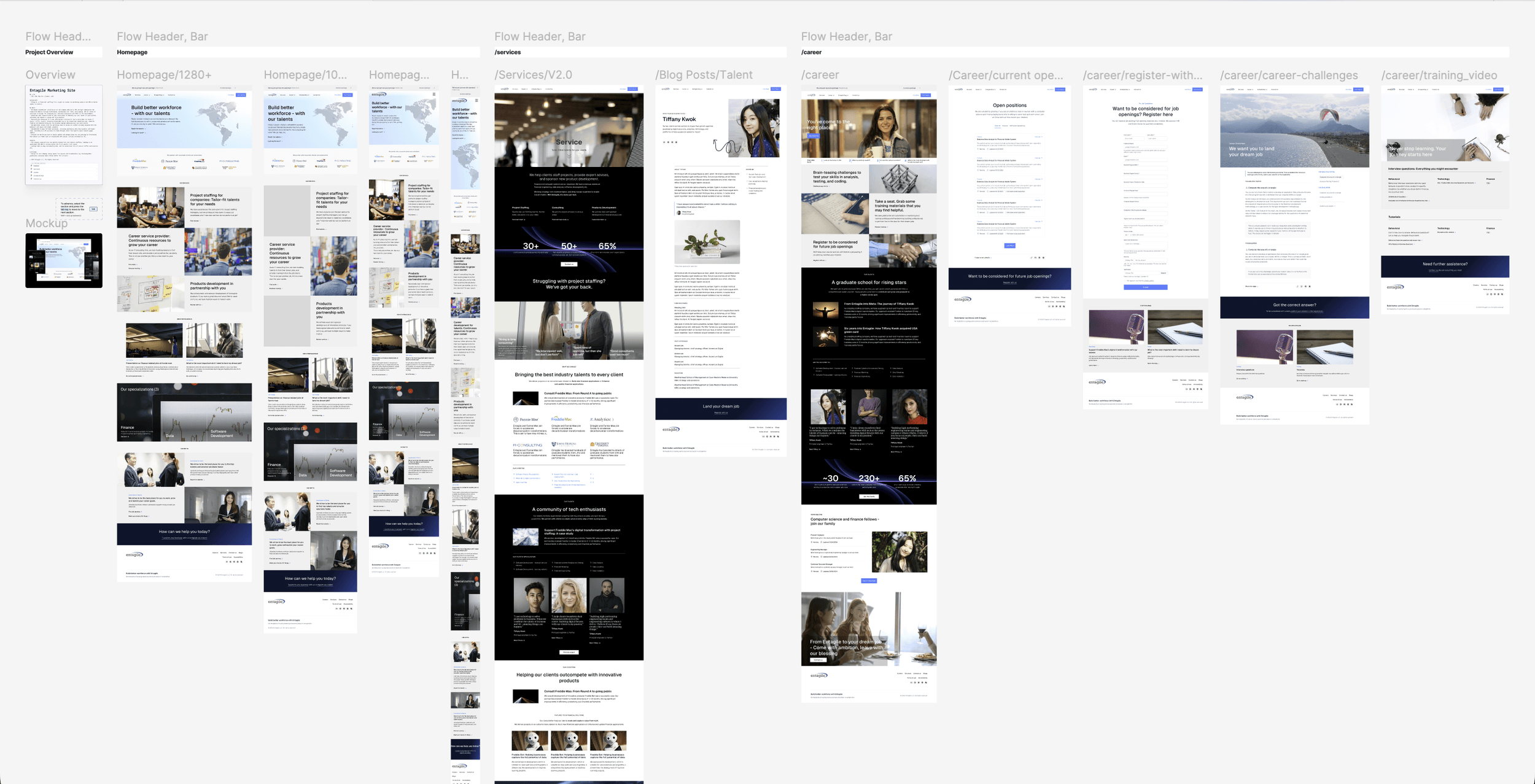
I built interactive Figma prototypes for every page, including five career sub-flows, and designed responsive layouts at four breakpoints. I targeted WCAG 2.1 AA, the latest published WCAG version at the time, addressing contrast, legibility and navigation.

The proposed homepage, top to bottom in three columns: a shared hero, then separate paths for companies and candidates, mirrored down to the values section.
The Entagile homepage in three parallel columns, read left to right: the dual-CTA hero and partner logo bar over the three service tracks; the products-development block, the Commitment to Clients / Commitment to Talents motto pair, and the blog; then the training and career-challenge cards, the why-choose-Entagile differentiators, and the conversion footer.

Build

I learned Framer on my own time, then asked to build the design myself.

The build wasn't originally my job. A developer on the team was implementing my Figma designs, and we worked through the usual handoff: asset packages, breakpoint specs and back-and-forth on details that didn't translate.

At the time, Framer was emerging as a serious site-building tool. I spent evenings and weekends learning enough of it to be credible, then proposed to Victor that I build the design myself, explaining why I thought it would get closer to the design with less translation. He agreed. Learning the tool was the easier part; learning how to ask for more scope within a team was the more useful one.

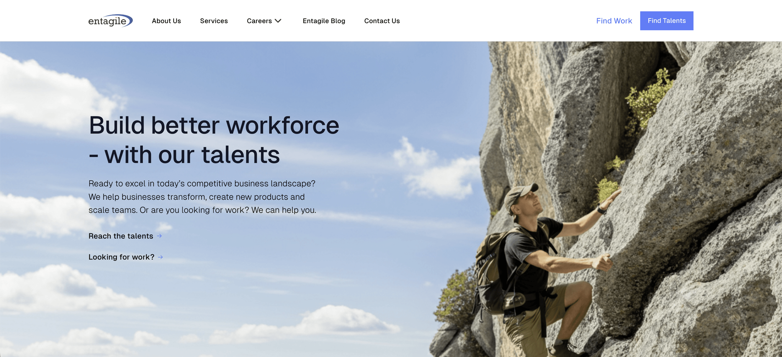
The live homepage hero at the time, and my Framer redesign on staging: one headline, two clear paths.
Redesigned Entagile homepage hero with clear dual audience pathsBeforeAfterBefore: Old Entagile homepage hero on WordPress. After: Redesigned Entagile homepage hero with clear dual audience paths.
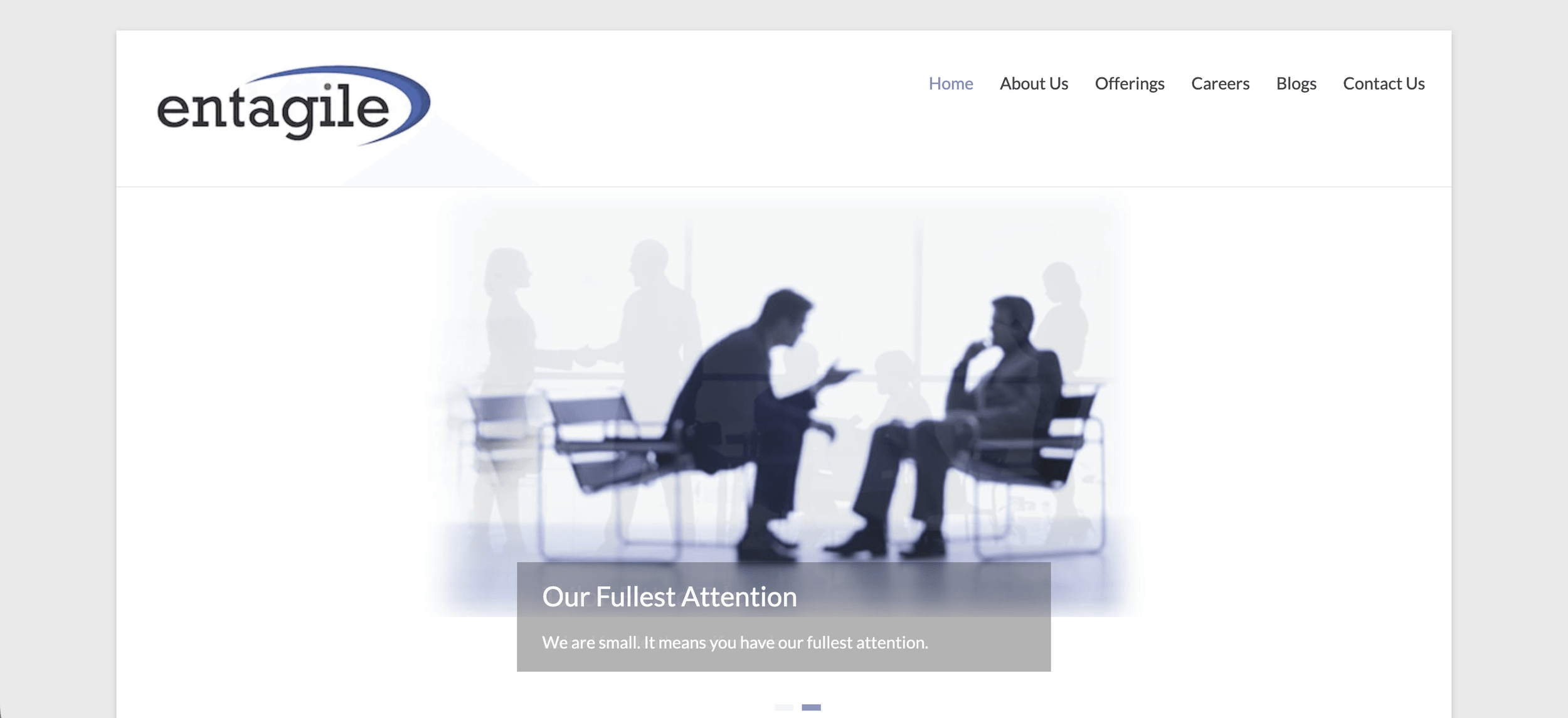
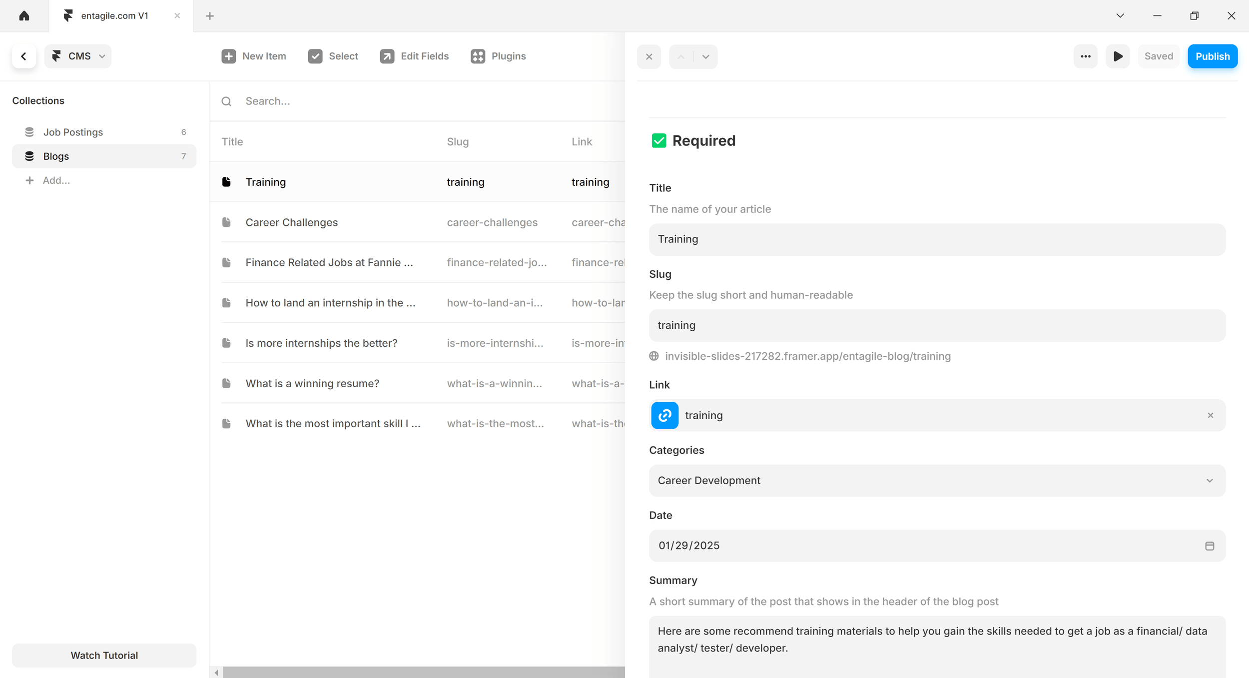
In Framer, I configured a CMS with two collections, Job Postings and Blogs, using structured fields for title, slug, categories, date and summary. The capture below shows six job-posting items and seven blog items in the staging site.

The Framer CMS on the staging site: Job Postings and Blogs collections with structured fields.
Framer CMS showing the Blog collection with seven published articles and structured content fields

Outcome

The live site's engagement improved; the full Framer redesign stayed on staging.

Adding information and improving the live site's information architecture increased organic click-through rates by 9% and average time on page by 46%, compared with the live site before those changes.

Separately, I delivered the Framer redesign to staging, and Victor decided not to adopt it on entagile.com for two reasons. Entagile's audiences, mostly senior executives and students, responded better to a clean, professional site than to a visually complex one. He also didn't want the live site to reveal that much detail about how the business worked, since competitors could copy it.

Testimonial

Chevis studied user research at George Mason University before I hired him as an intern. He's an extremely loyal, likeable, bright, and skilled product designer. His superpower is his empathy with users, and a unique talent to combine that with his skills for interface design. He's incredibly curious and always wants to learn more and dig deeper. His work on our marketing site is impressive and really surprised me at the time. Chevis is incredibly fun to work with, his energy level is nuts.

Victor Wang
Victor WangFounder & Managing Director, Entagile

Key Takeaways

Research gives a junior designer a way to argue

I was the most junior person in the room, proposing to restructure the company's website. The conversation worked because the structure came from interviews with the firm's own audiences, and from months spent learning how the business actually worked.

Expanding scope is a team conversation

This was my first US work experience. Taking on the build worked because I proposed it as a workflow change the founder could evaluate, with the developer's handoff context in mind, rather than simply taking it over.

Deliverables

The Figma design and the Framer staging site.

The Framer staging site shows the design on desktop and mobile, with the CMS structure. The design work behind it, from wireframes to final screens prepared for developer handoff, is in the Figma design file.

The full design in Figma: homepage across breakpoints, plus the services, blog and career page flows.
Figma overview of the full Entagile design: homepage at three breakpoints, services, blog, and career flows

Related Work