Chevis ZhouSolara: Building a developer's home — one visual system behind every page.

ThemeVisual design & systems
PlatformWeb
RoleUX Lead — Feature Scoping, Research, Interaction Design, Visual Design, Prototyping
YearQ2, 2024
CollaboratorsIisakki Rotko (SWE), Mario Buikhuizen (SWE), Maarten Breddels (PO), Bobby Liu (PM)

Feature Scoping, Prototyping. Design handed off in Q2 2024. Launched in Q4 2024.

Solara, an open-source Python web framework, lacked the infrastructure to sell. I owned the design strategy for its documentation portal, and built the visual system underneath it — a 100+ component Figma library resolving through 49 semantic color variables. The portal launched into the framework's steepest year of growth.

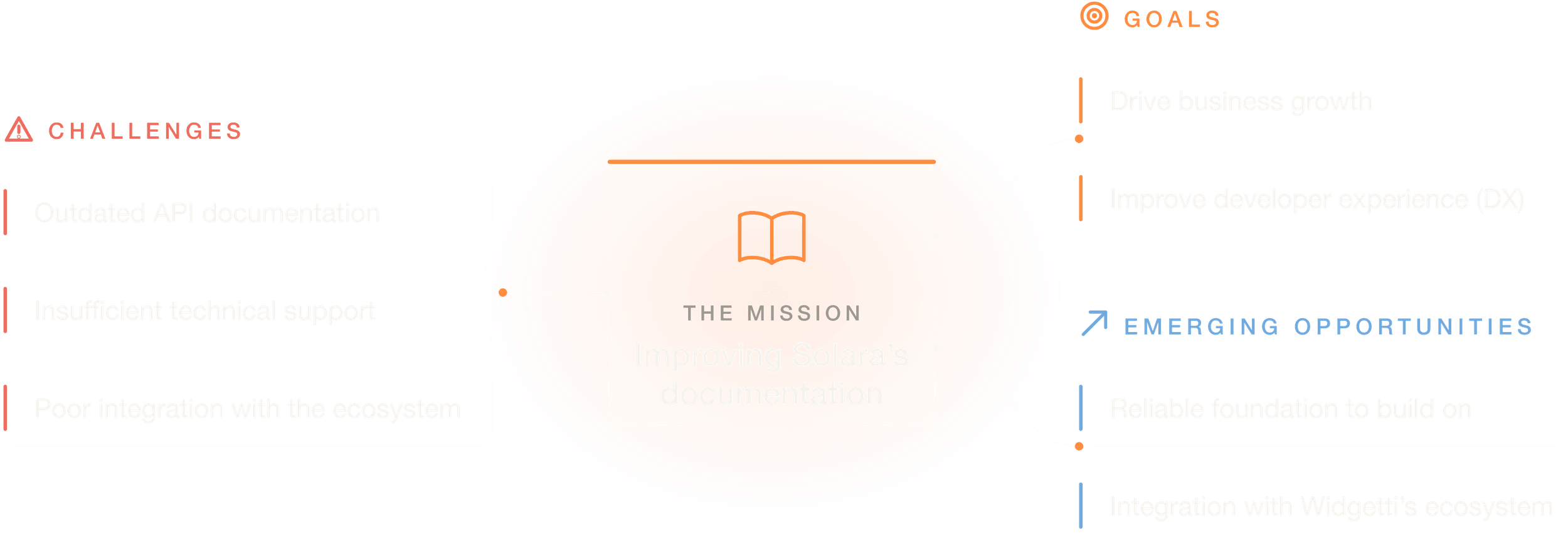
Support the future of front-end development in the Python ecosystem — a documentation portal for communicating Solara's capabilities and supporting users.

For an open-source framework, documentation is the product's sales floor: it's where a curious developer decides — usually within minutes — whether to trust you with production code. Solara, which lets developers build scalable web applications in pure Python, had a booming user base (2,000+ GitHub stars) but a documentation portal that couldn't carry that decision. Jargon-heavy reference pages and poor findability were quietly capping growth and blocking the path to enterprise licenses.

As UX Lead, I owned the design strategy for the documentation portal, collaborating cross-functionally within a team of 5 to scope and prototype feature sets — code error reporting, customizable components, and GitHub interconnection. Along the way I rebuilt the design system as a 100+ component Figma library, sized to replace the in-house component library as engineering worked through it.

This case study covers the documentation portal and the design system behind it. The visual identity and marketing homepage from the same engagement are a separate story — see the Solara marketing site case study.

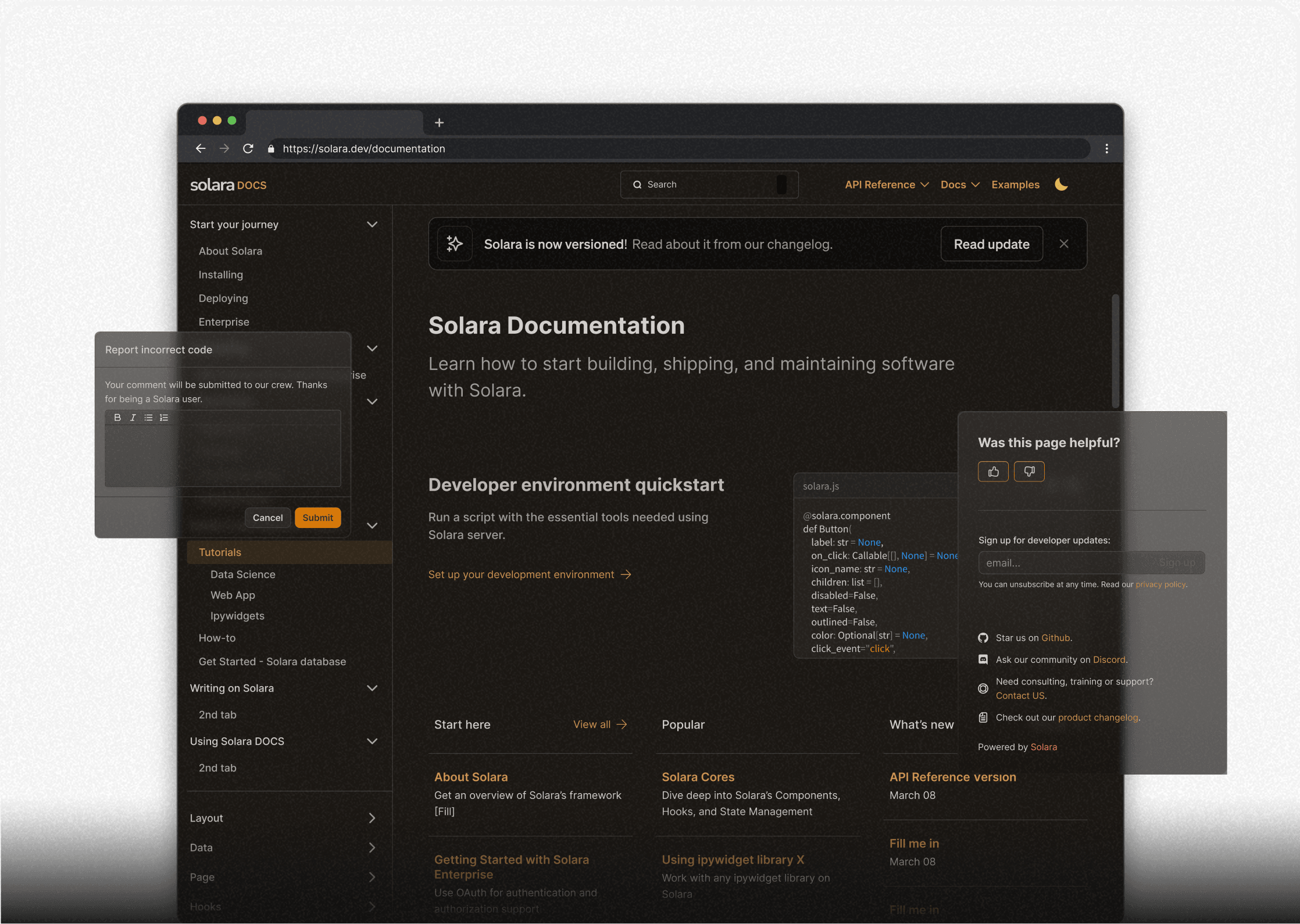
The redesigned Solara documentation portal
Solara documentation portal
Impact
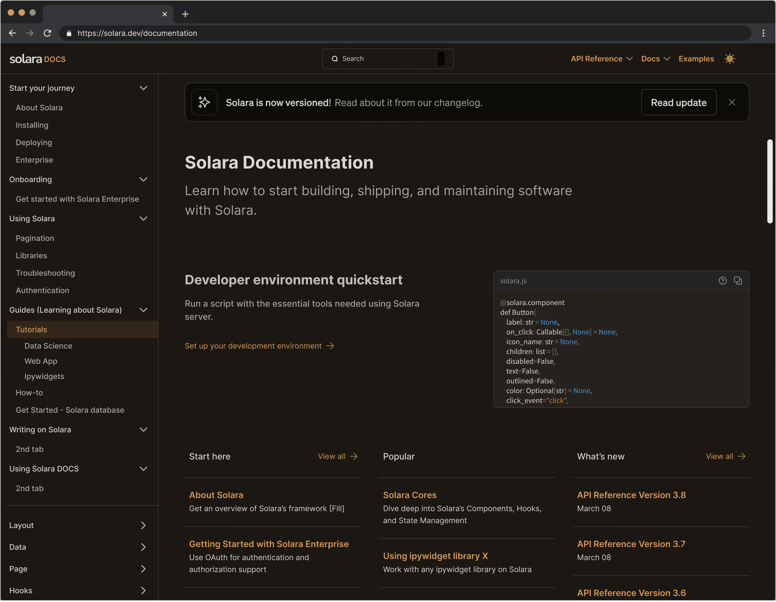
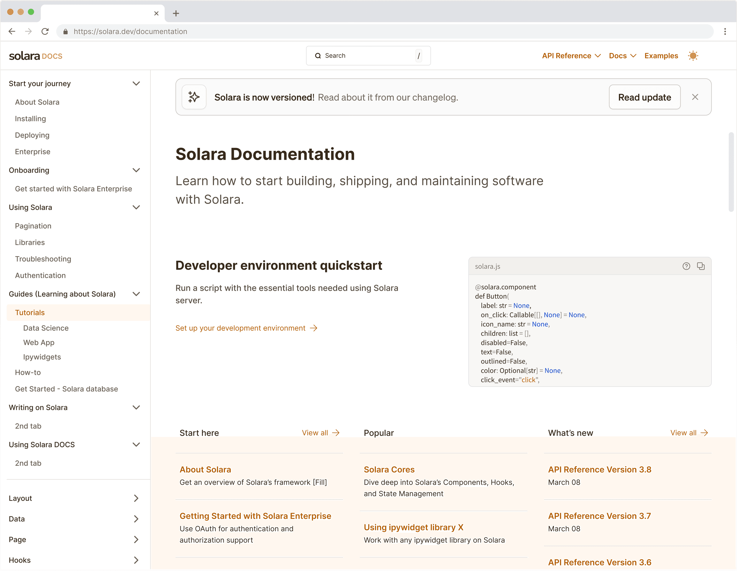
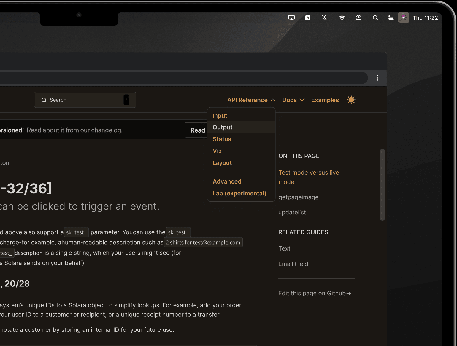
Switching Light/Dark Mode Interaction
Light/Dark Mode Homepage
Documentation homepage in dark modeLightDark

Context

Solara's mission: simplify front-end development

More scalable applications

Developers often struggle to efficiently transition data projects from Jupyter notebooks to scalable web applications due to the complex coding requirements involved.

Solara, a Python-based framework, simplifies this process — aiming to increase revenue to the tune of $10 million in just a couple of years, and reach 30,000 developers. This is no niche bet: built on ipywidgets, Solara runs inside Jupyter Notebook, JupyterLab, and standalone servers alike — a bigger-picture story Maarten later told in a tutorial series on the official Jupyter Blog.

Solara Homepage
Solara homepage
Solara kicks off a seed funding round

Widgetti is Solara's parent company; Solara is the major open-source library of Widgetti. In Q4 of 2023, prior to me joining the design team as a contractor, Widgetti shipped a major Solara update that was well-received.

As Solara rapidly matured, it became necessary to overhaul its website and scale its design operation around selling enterprise licenses. We researched competitors such as Next.js and Retool, and evaluated our total addressable market.

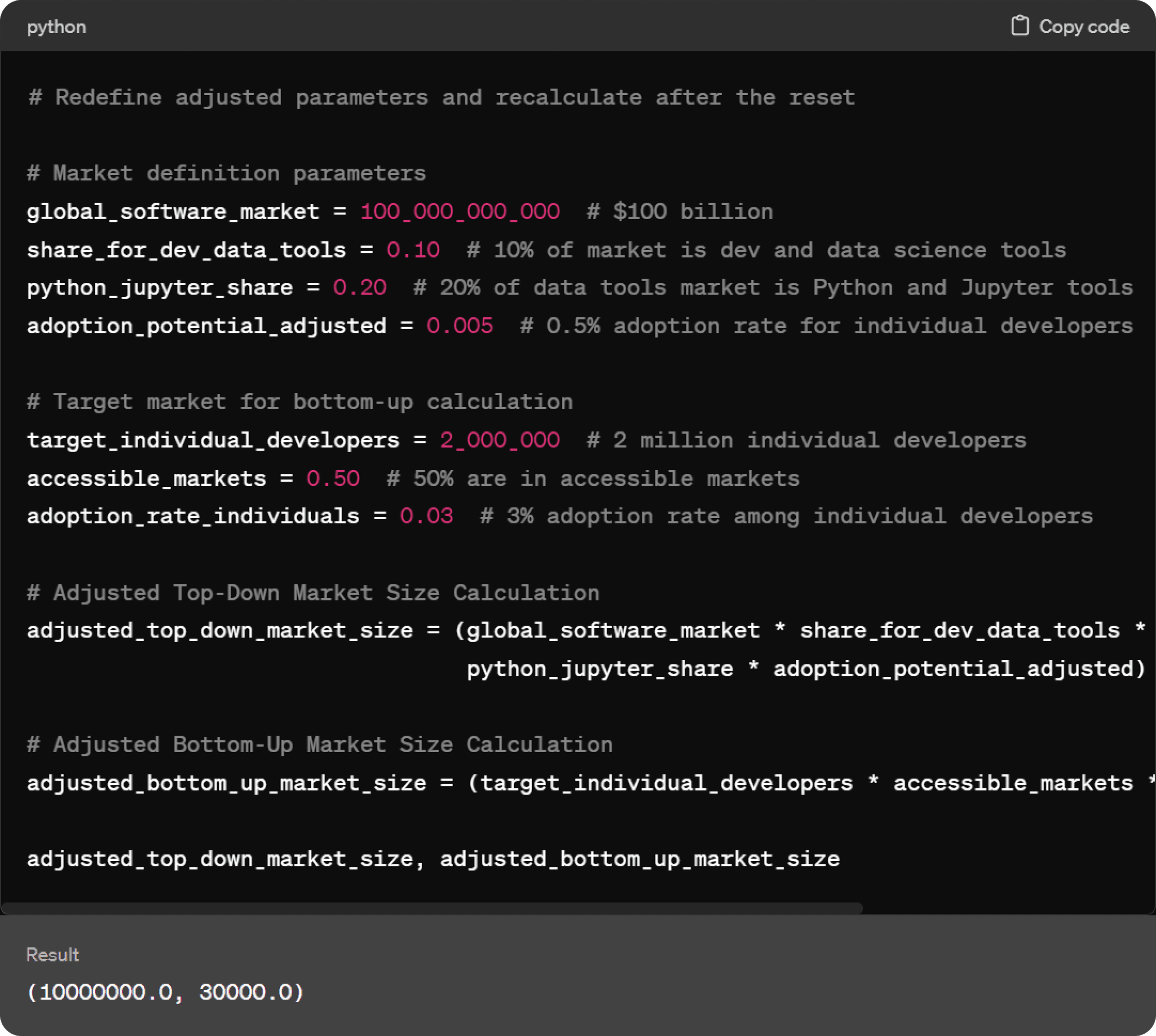
Market size evaluation
Python script calculating Solara TAM — top-down $10M market size and bottom-up 30k developer reach

Top-down: Starting with the $100 billion global software market, and narrowing down to Python/Jupyter users within the data science tools segment, the estimated market size is $10 million.

Bottom-up: Based on 2 million individual developers, with 50% in accessible markets and a 3% adoption rate, the potential is to reach 30,000 developers.

Problem

Solara lacked the infrastructure to sell.

Python developers struggle to efficiently transition their data projects from Jupyter notebooks to robust web applications. Solara solved that at the framework level — but the website undersold it. Addressing this gap could unlock an additional $10 million in annual revenue.

The API documentation was outdated

Good documentation is a developer's best friend; a bad one is their enemy. Although Solara shipped excellent features and fantastic integration tools, developers struggled with unnecessary jargon and poor UX. The consequences were measurable: visitors left before the product could make its case, engagement stayed low, and conversion suffered. In a competitive market, the lack of well-structured documentation made Solara harder to adopt than it deserved to be.

Solara Scope
Solara project scope
What great documentation had to accomplish

Drive business growth:

  • Improve credibility — showcase our commitment to support, stability, and reliability.
  • Attract users organically.
  • Cut overhead costs on training and support.

Be a developer's best friend — improve developer experience (DX):

  • Smoothen the code review process: help developers identify and submit bugs to our GitHub Pages site.
  • Improve findability of Solara functions: help developers understand what they have to do in terms of project requirements, codebase, or current workflows.
  • Facilitate efficient onboarding of new developers.
  • Increase perceived software quality and reduce time-to-market for Solara products.

Scoping

A functional spec kept the redesign honest.

Before any pixels moved, I scoped the work in a functional spec shared with product and engineering — goals, non-goals, measurable outcomes, and a risk register. One document, one shared definition of done.

Goals & non-goals
  • Revamp the UI/UX of the web documentation so it's intuitive and easy to navigate — a dashboard-like design for the API reference.
  • Redesign the marketing site for appeal and engagement, keeping one cohesive experience across all of solara.dev.
  • Non-goal: content creation. The spec explicitly limited scope to the presentation and usability of existing content — which kept the timeline defensible.
What success looks like
  • Quantitative: longer time-on-page in documentation, lower bounce rate, improved sign-up/trial conversion, fewer documentation-related support requests.
  • Qualitative: positive feedback from surveys embedded in the documentation, and rising engagement on GitHub and Discord.
How things could go wrong
  • GitHub-first users might bypass the website entirely — mitigated with prominent, bidirectional links between the docs and GitHub.
  • Errors in published code snippets could flood support — prevented with robust error handling and testing before snippets ship.
  • The new error-reporting flow could be abused — deterred with rate limiting and CAPTCHA.
  • Accessibility was scoped as a requirement from day one, not a post-launch patch.
Rollout requirement

New design components had to integrate with the existing in-house component library and be adopted gradually — minimizing disruption while the site stayed live.

Research

Clearing the fog — work backwards from developer pain points.

User interviews — what our current user base was saying

It was critical to first understand where the doc fit in amongst the other pillars of Solara-based development lifecycles. So I organized existing feedback from Solara's beta launch — this way I had a foundation to continue building upon.

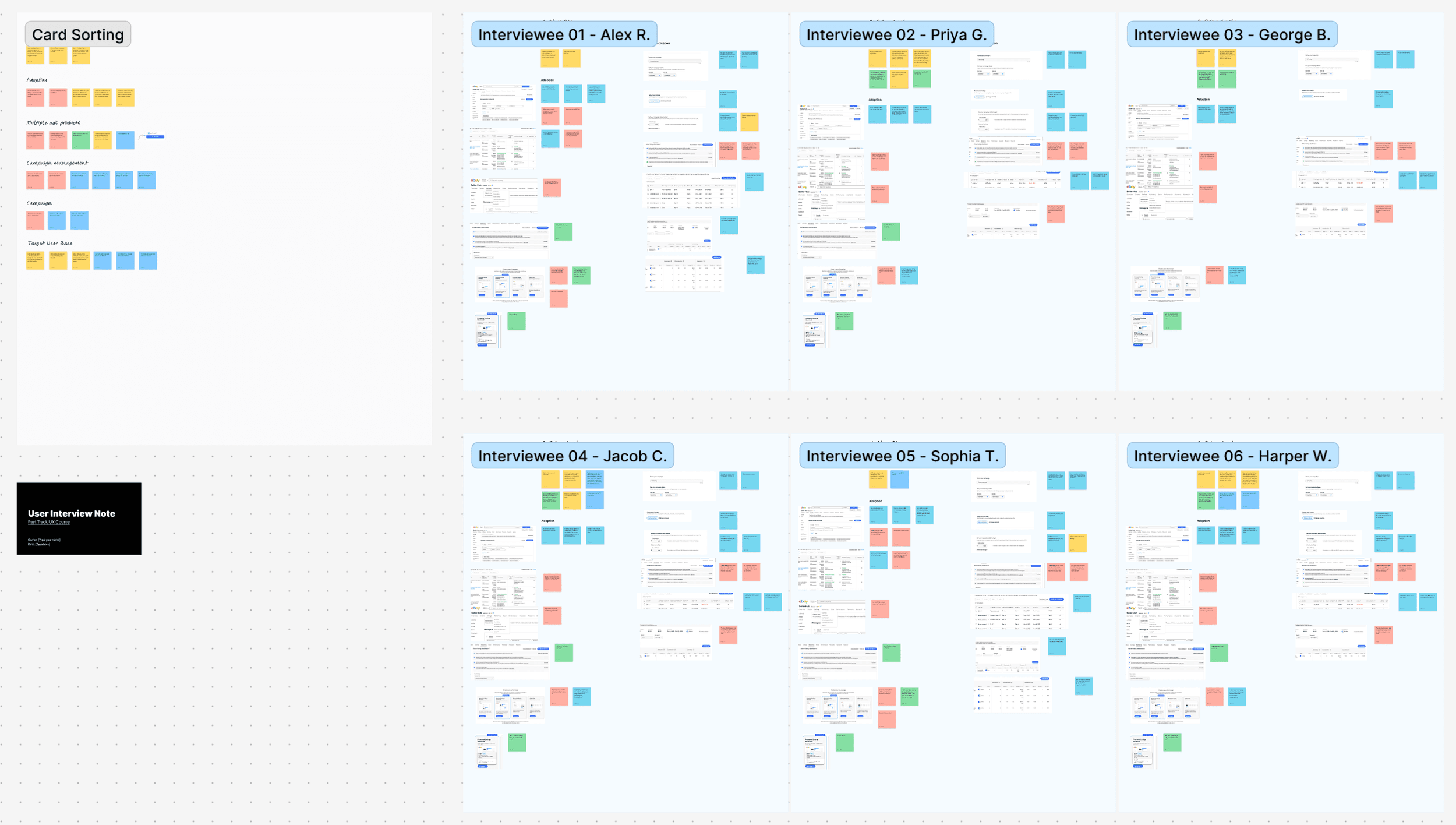
When I joined the team, discovery interviews for the beta launch had already been conducted. While on a different team, I used the discovery interview notes to identify participants for a survey to understand developer pain points. And by consulting a customer success teammate with prior marketing experience, I was able to ask the right questions in the right way. This survey gave us valuable input from clients and a clear direction for immediate and long-term Solara ecosystem integration updates.

Discovery Interview Feedback
Discovery interview feedback
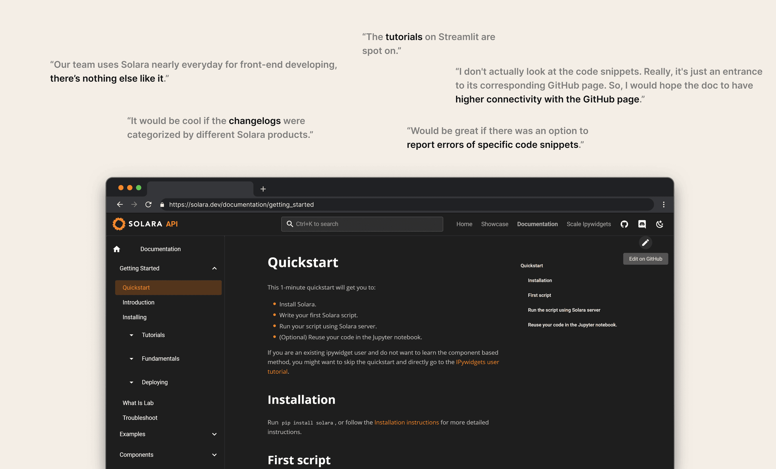
Solara Beta Launch Feedback
Solara beta launch feedback
Insights
  1. Developers highly value text logs.
  2. A smoother code review process leads to higher dev efficiency.
  3. An efficient onboarding experience improves findability of Solara functions.
Emerging opportunities
  • What if thoughtful details could communicate that our framework is a reliable foundation for building and running software?
  • What if the web documentation facilitated the integration of Solara with our parent company Widgetti's products, nurturing the entire ecosystem?
  • Survey respondents flagged two future priorities — external-facing apps and a mobile app builder. Whatever we shipped, the documentation's information architecture had to scale past internal-tool use cases.
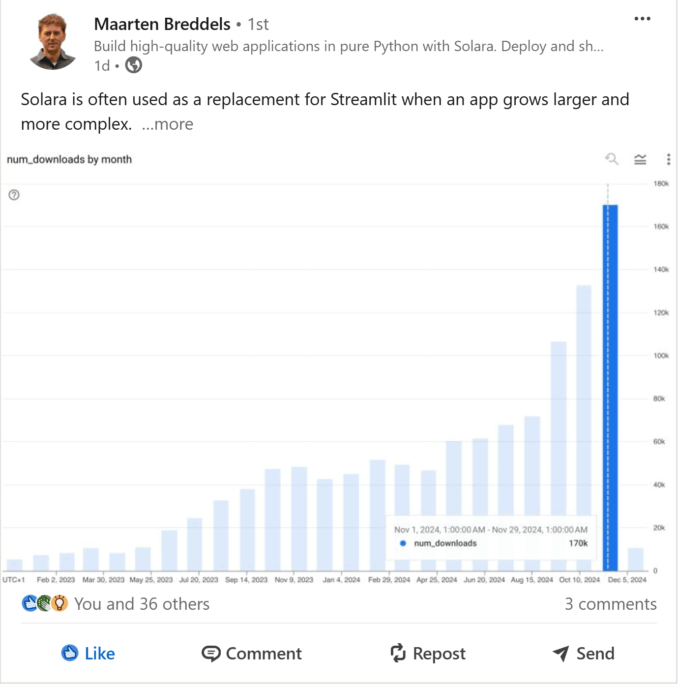
Solara Monthly Downloads Number
LinkedIn post by Solara co-founder Maarten Breddels showing the monthly-downloads chart peaking at 170k in November 2024

The growth curve, announced by co-founder Maarten Breddels: monthly downloads surging to 170k in November 2024.

Design Process

Design for business impact

I made design decisions based on direct user feedback, estimated conversion rates, and considerations for design scalability — iterating fast on rapid feedback. Interviews, testing, and surveys drove what got prioritized and how information was consolidated, in an agile cadence of design reviews with product and engineering.

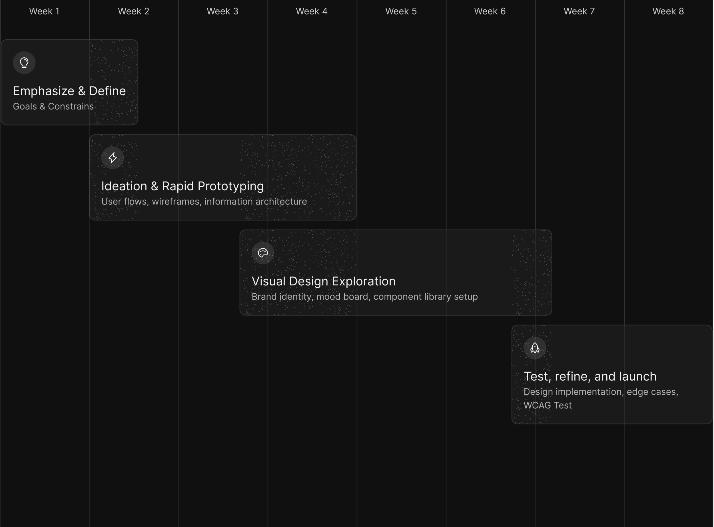
Project process within timeline

North Star metrics acted as the guiding compass throughout: Daily Active Users (DAU), Weekly Active Users (WAU), and monthly downloads kept every design initiative aligned with the company's strategic objectives rather than personal taste.

Final Design

One Stone, Three Birds.

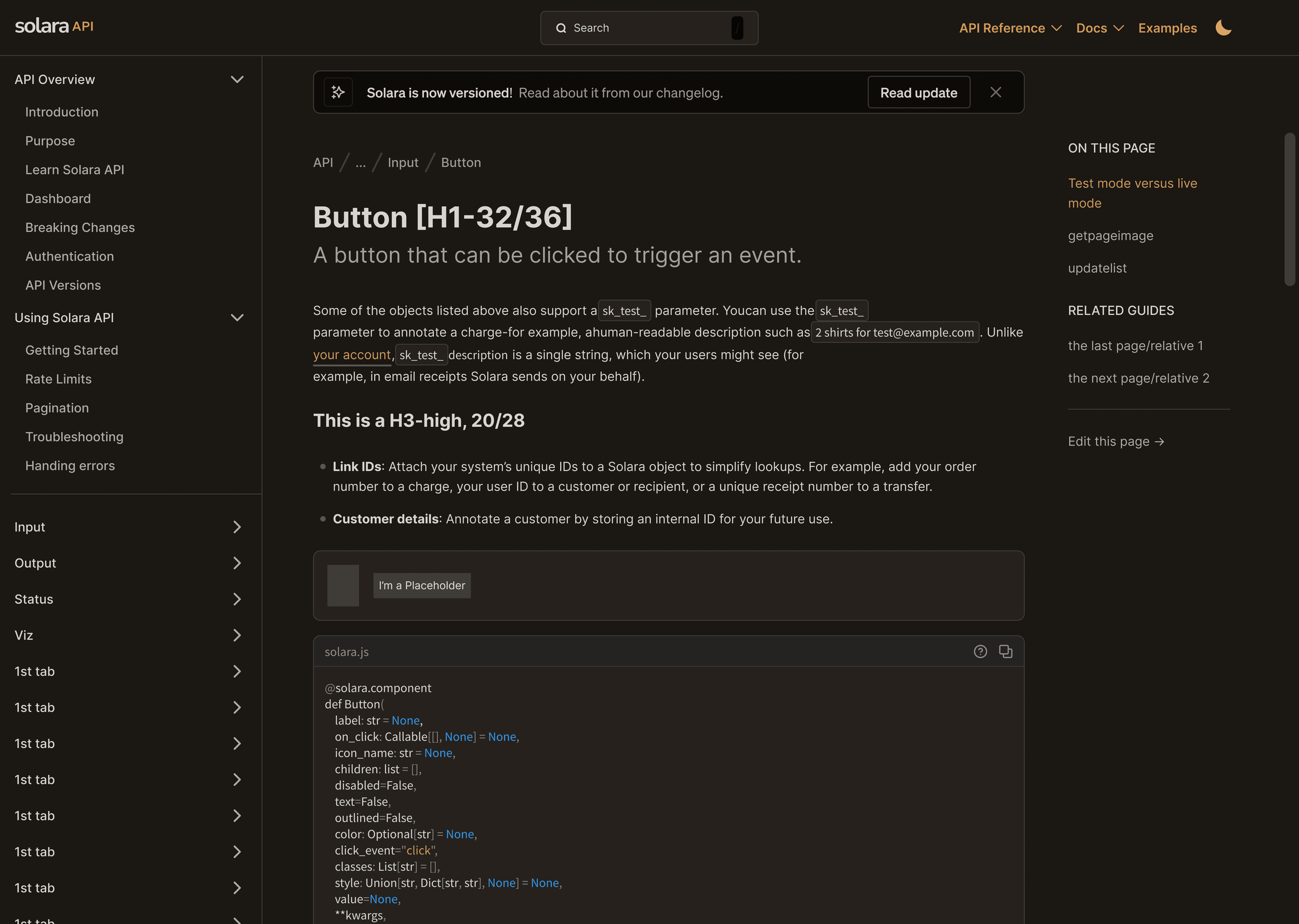
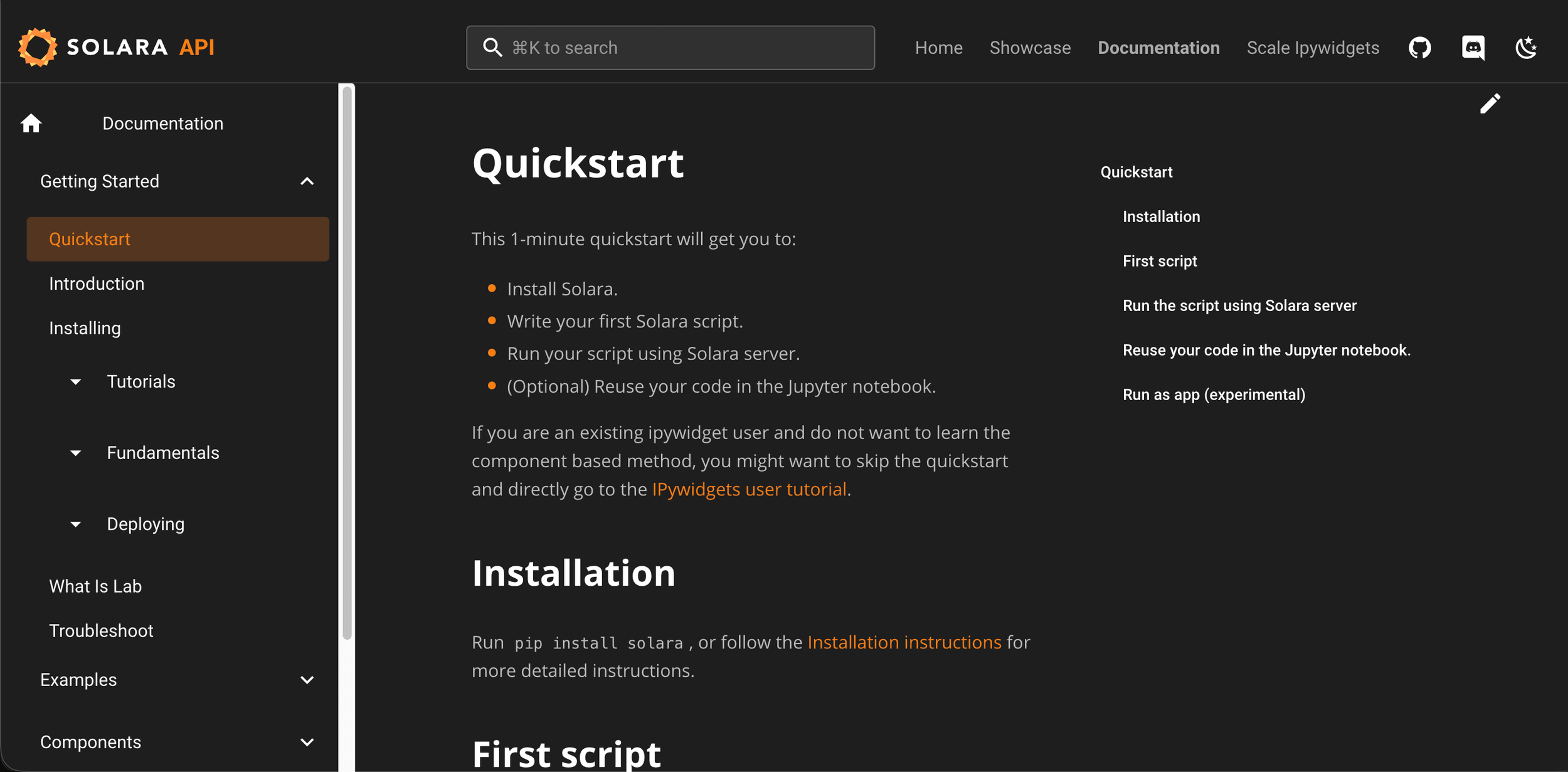
Previously, the documentation felt dated — generic pages with no clear browse structure and no shared component language. The redesign routes developers through structured API navigation, specifies a cohesive dark-mode UI, and grounds every screen in a 100+ component Figma library. Typography, spacing, and interaction patterns stay consistent from Quickstart to component reference. One system, three payoffs — though only the first of the three made it to production intact: the navigation and taxonomy shipped, the visual system mostly stayed in the design file.

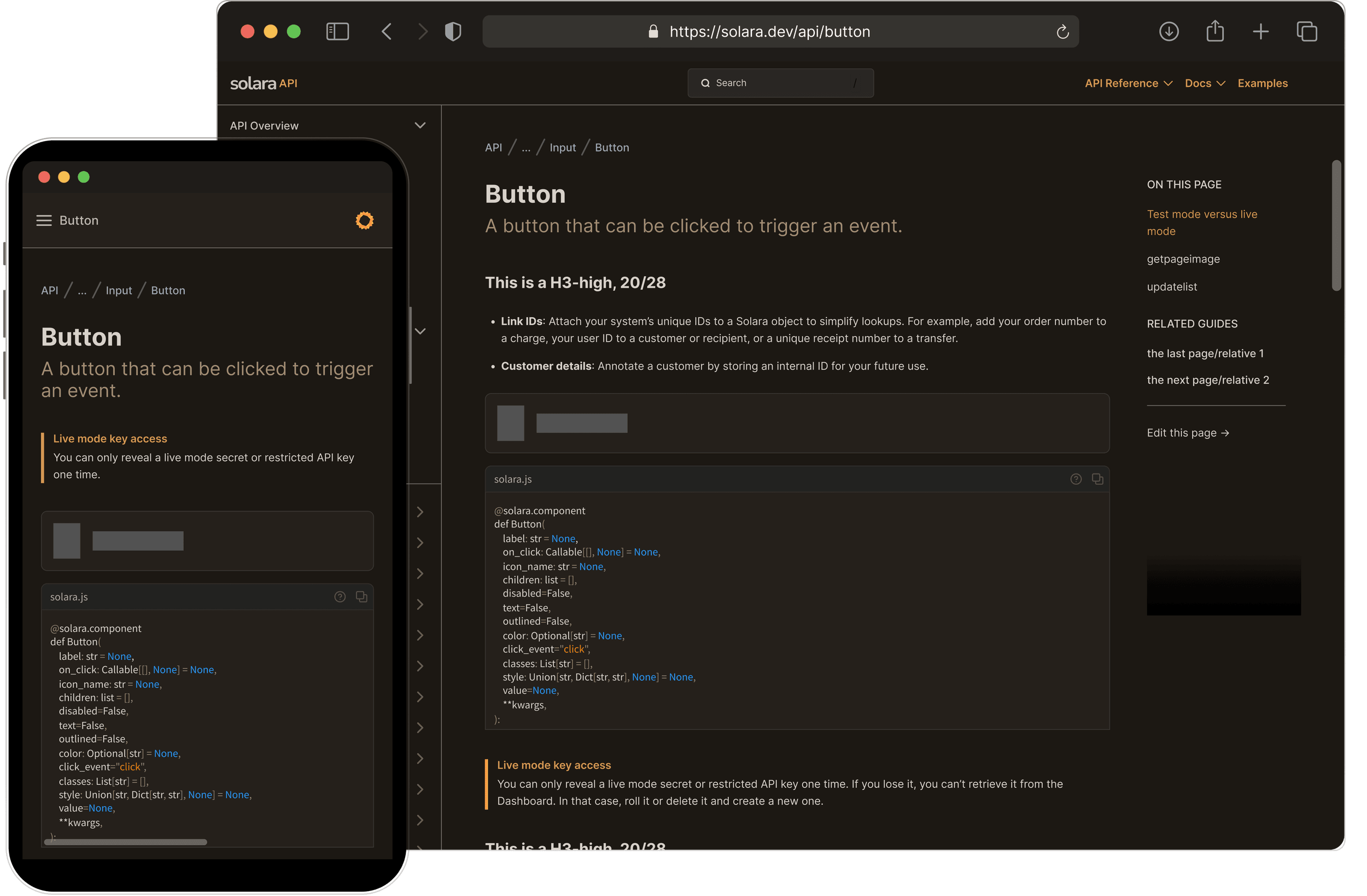
API Reference in Dark Mode — Desktop & Mobile
Final API reference page for the Button component in dark mode, shown on desktop and mobile — breadcrumb, code signature block, callouts, and an 'On this page' rail
API/Component Page Interaction
Before/After API Page
API documentation after redesign — component reference pageBeforeAfter

What it all leads to

Before
  • API reference buried in generic Quickstart pages
  • No taxonomy for browsing components
  • Unclear path from install to production code
After
  • Component pages one click from API nav
  • Input / Output / Viz browse structure
  • Quickstart → API reference in two clicks
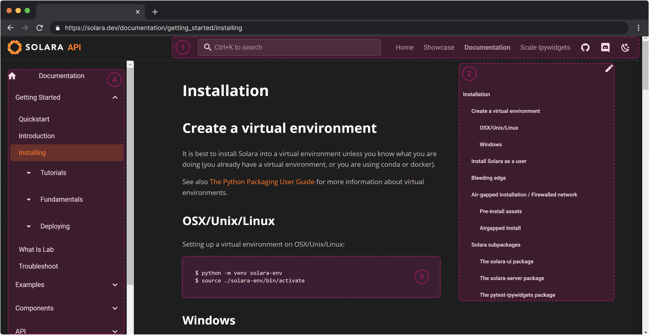
IA zoning audit on the live dashboard — four zones checked for spacing and function-by-location separation, the structure that did ship.
Post-redesign audit of the live Solara documentation dashboard, with four numbered zones marked over the shipped layout
Left Pane Interaction
Top Navbar Layout
Top navbar layout
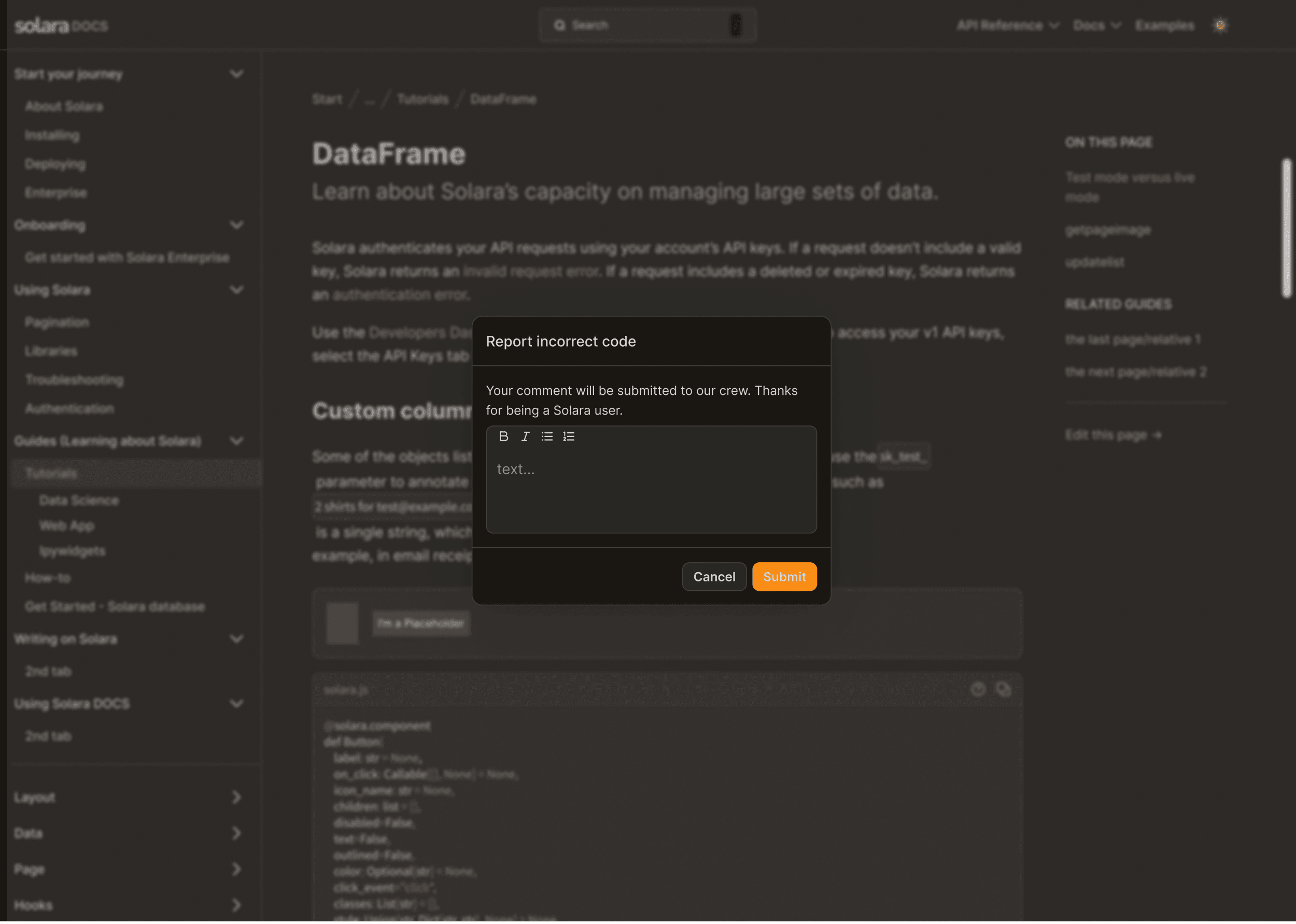
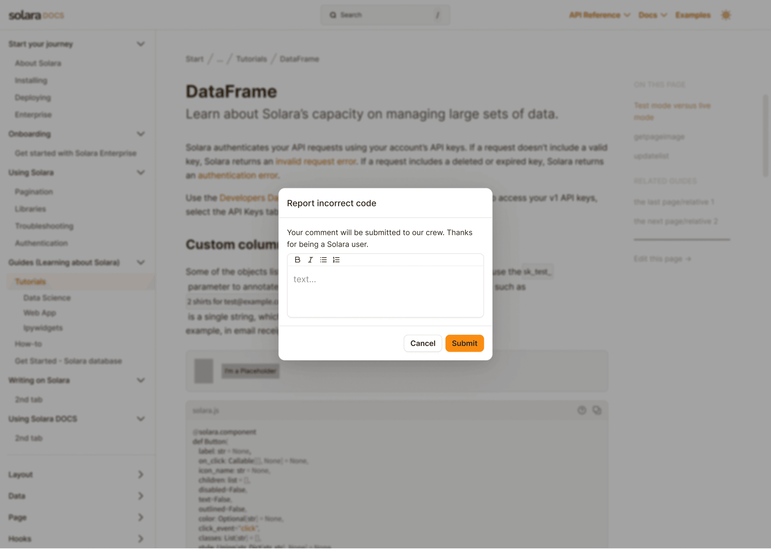
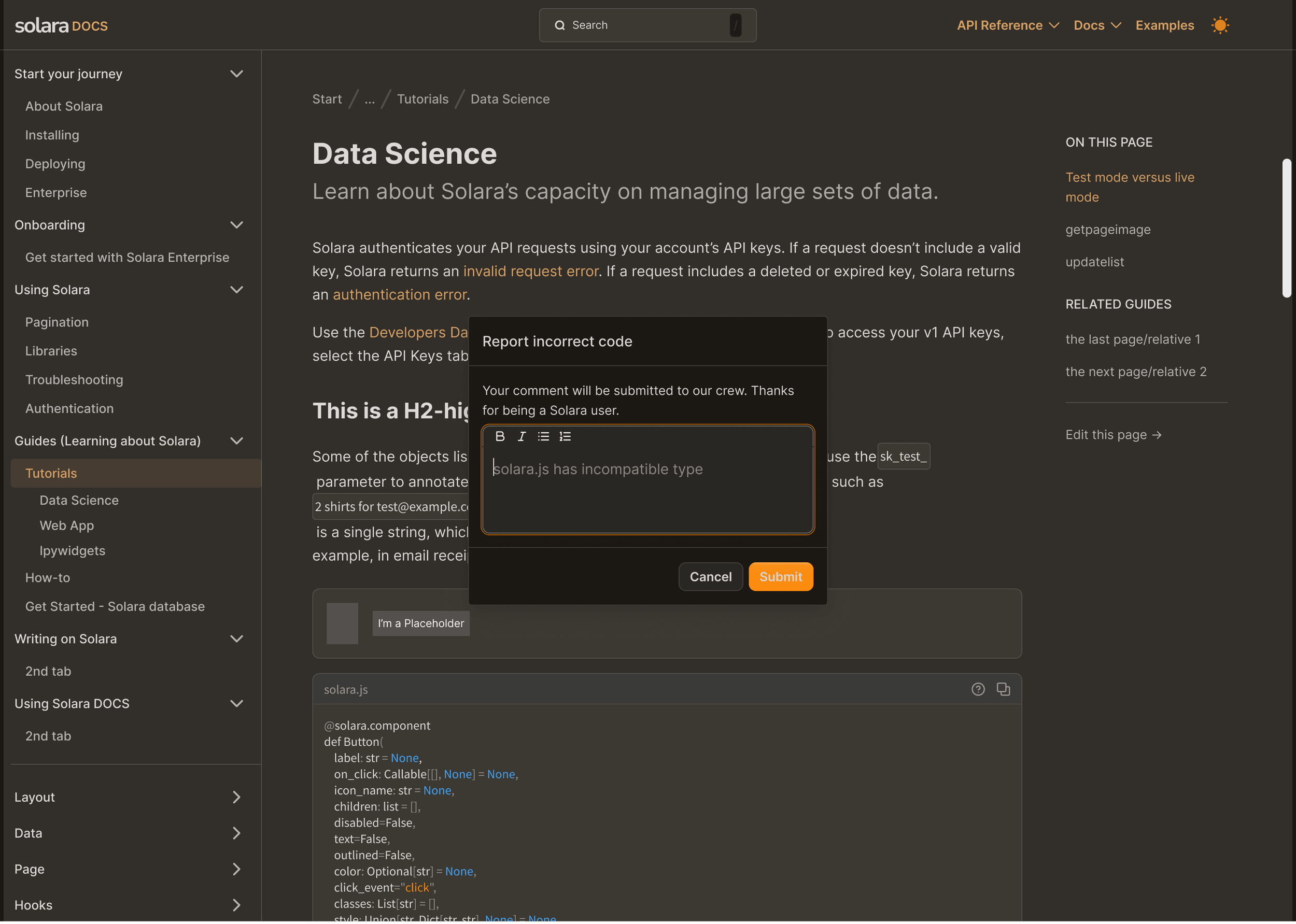
Light/Dark Mode Modal
Documentation modal in dark modeLightDark
Footer Review Interaction

Responsive Design

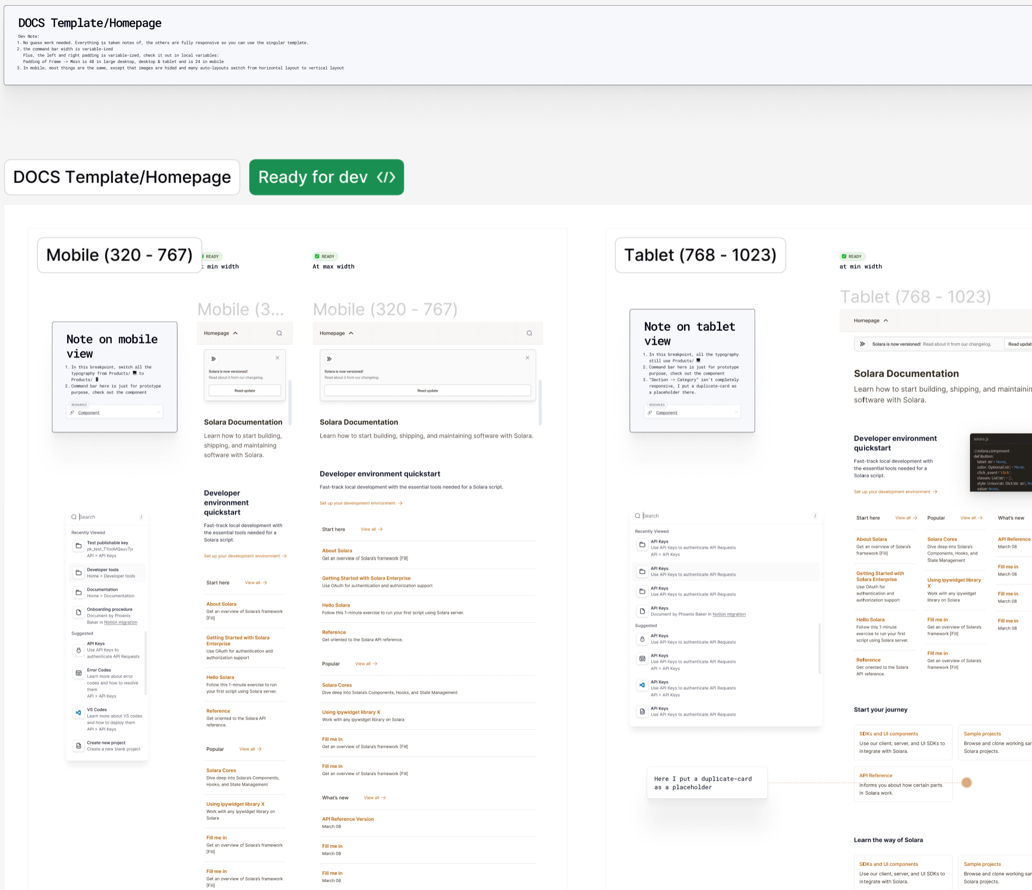
Four breakpoints, one template — annotated until no guesswork remained.

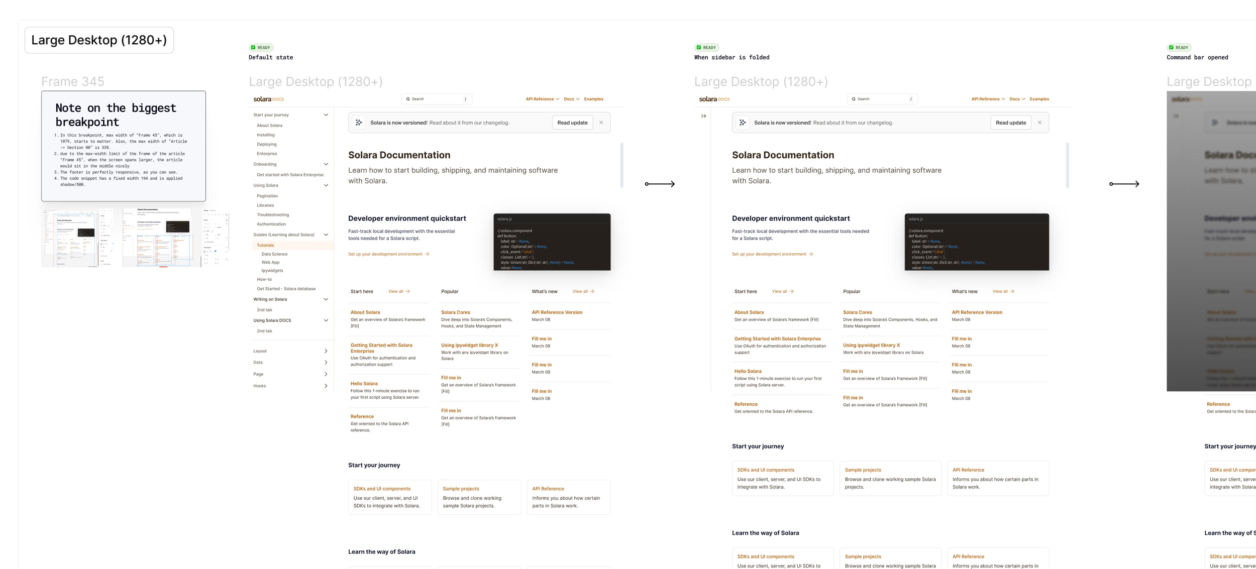
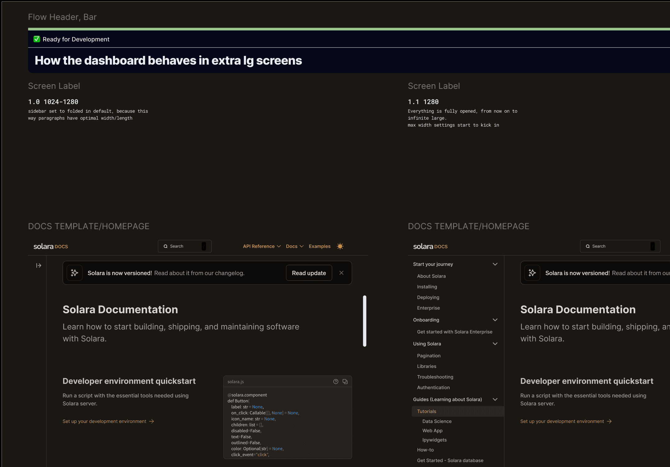
Every core page shipped as a prototype at four breakpoints — mobile (320–767), tablet (768–1023), desktop, and large desktop — covering the API reference, component dashboard, docs homepage, content pages, and Quickstart.

The responsive behavior was specified directly on the canvas, next to the frames it describes. The dev notes read like a contract: one singular, fully responsive template; the command bar and frame padding driven by local variables (48px on desktop and tablet, 24px on mobile); and on mobile, imagery hidden while auto-layouts switch from horizontal to vertical. Each page carried a "Ready for dev" status so engineers never had to guess what was final.

Responsive Spec — Mobile & Tablet Breakpoints with Dev Notes
Docs homepage responsive spec in Figma — mobile and tablet breakpoint frames with 'Ready for dev' badge and detailed dev-note annotations
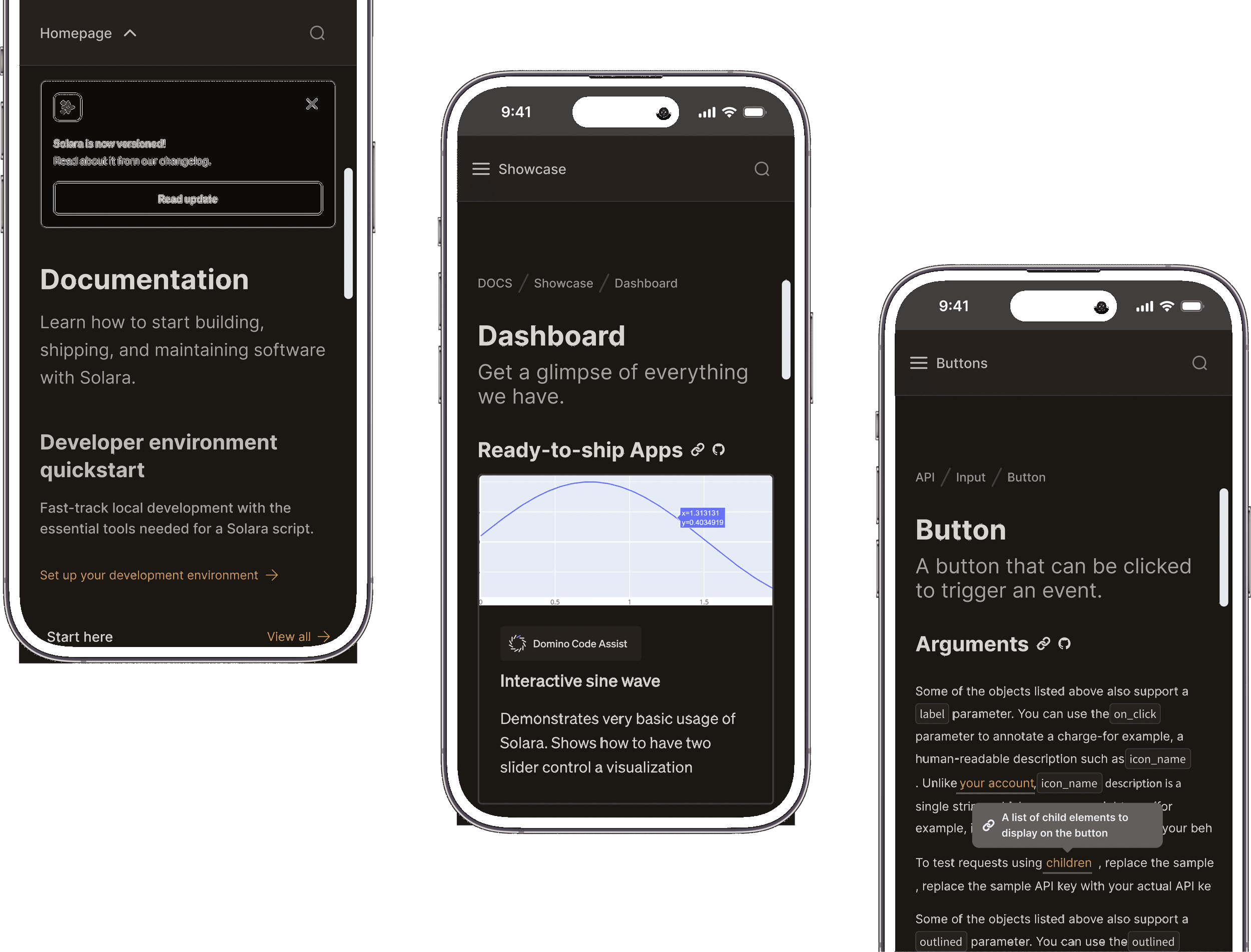
Documentation portal — mobile views
Solara documentation on mobile — homepage, showcase dashboard, and API button reference across three phone mockups

Design System

Three trips down the token ladder — each one correct, the sum heavier than the team.

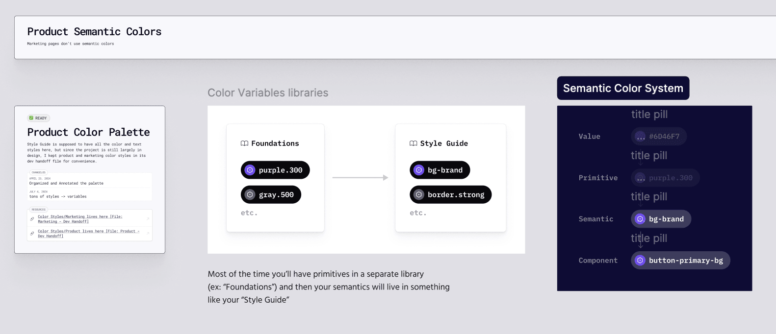
I was the solo designer on Solara, so every architectural call in the design system was mine to make and mine to answer for. The token architecture escalated three times over the engagement — not one over-engineered decision, but three individually reasonable ones, each pulled by real scope growth. I was working through Ridd's Figma Academy 2.0 (Dive Club) at the time, and his specificity ladder — value → primitive → semantic → component — is the cleanest frame for what happened, so I'll borrow it here.

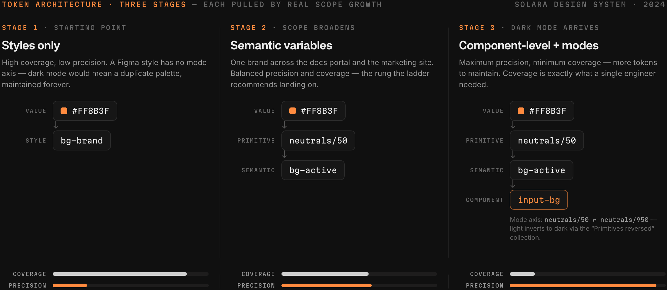
The three stages on the specificity ladder: precision rising left to right, coverage falling with it. That inversion is the whole story. Ladder concept after Ridd's Figma Academy 2.0.
Diagram of Solara's three-stage token escalation — styles only, semantic variables, then component-level variables with modes — with coverage falling and precision rising across the stages
Stage 1 — styles only

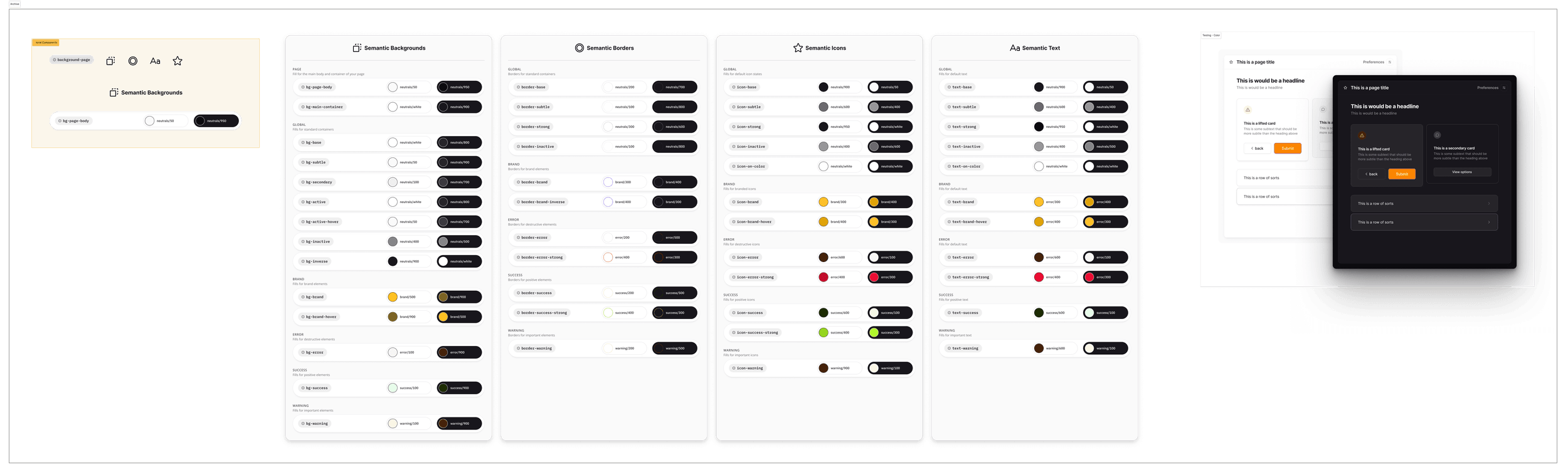
The system started on Figma styles, semantically named: bg-base, border-strong, each token documented with a hand-maintained light/dark swatch pair. Semantic names, flat architecture — a style has no mode axis, so "dark mode" meant maintaining a duplicate parallel palette by hand, forever. Right for the scope at the time; archived the moment the scope moved.

The archived stage-1 system — semantically named, architecturally flat. The only artifact in this study with a loser in it.
The archived Figma color style system — semantic background, border, icon, and text boards, each token paired with hand-maintained light and dark swatches
Stage 2 — semantic variables

Scope broadened: one brand now had to cover both the documentation portal and the marketing site. I rebuilt on variables with a semantic layer between raw values and usage — value → primitive → semantic — so purple could stop being a hex code and start being a decision. This is the rung Ridd's course recommends landing on; his own words are that starting a system from scratch, he'd probably fall into this scenario. The rebuild is dated on my own canvas — the Product Color Palette changelog reads "July 4, 2024 — tons of styles → variables."

Stage 3 — component-level variables + modes

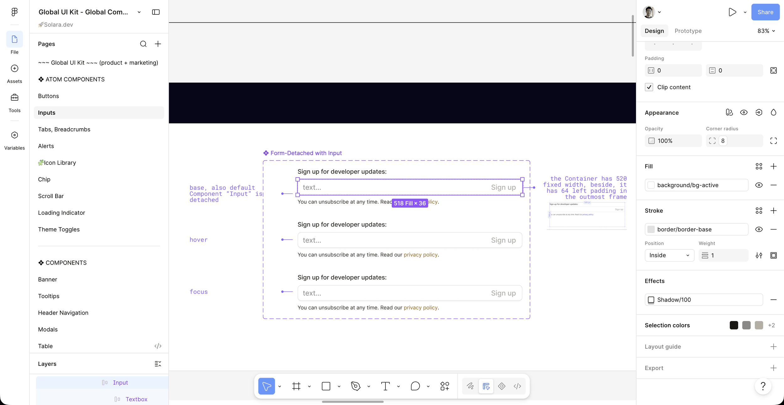
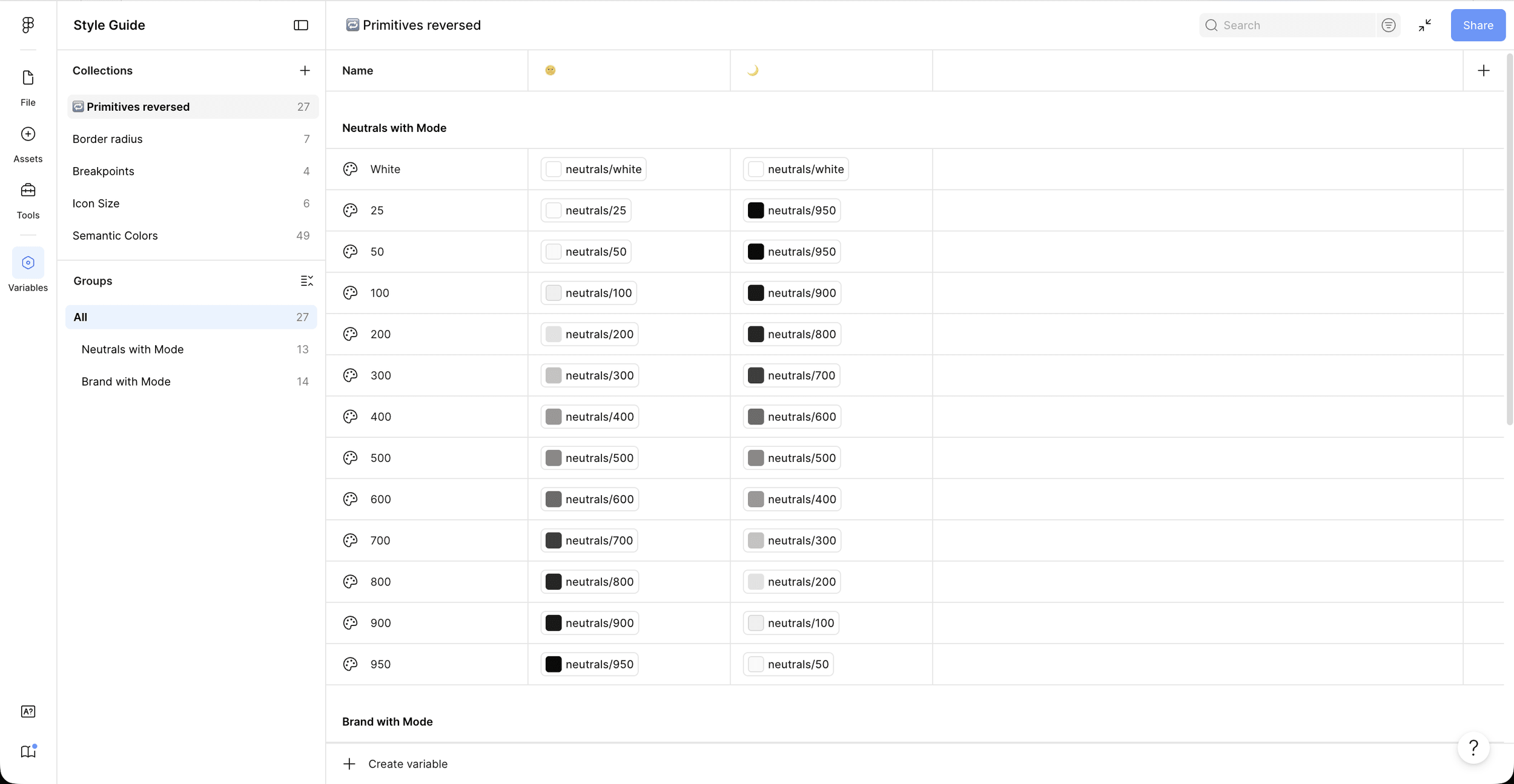
Then dark mode arrived. Variables have what styles never did — a mode axis — and the "Primitives reversed" collection became the engine: neutrals/50 in light resolves to neutrals/950 in dark, 100 to 900, all the way down the ramp. One semantic token, two rendered realities, zero duplicate palettes. And while I was in there, I kept going — down to component-level tokens like input-bg, the deepest rung the ladder has.

Here's the part I want on the record: the diagnosis was in the course I was learning from, while I was building. Ridd's component-token module warns that tokens this specific get used less often and cover less of the system — meaning you need more of them — and asks when, if ever, you need that level of specificity. I read that and took the aggressive branch anyway, because dark mode felt worth it. Precision is what I bought. Coverage is what one engineer needed. The system that came out of it is genuinely good — 49 semantic colors resolving through 27 mode-aware primitives, 100+ specified components — and it grew past what a one-developer implementation front could absorb: the components engineering could build cheaply landed, and the rest is still in Figma. Senior designers have all watched a system outrun its team; this one was mine, and the scoping spec's own rollout requirement — integrate gradually with the in-house library — is precisely the line it broke.

One more thing the canvas shows: the structure was never followed on autopilot. The Product Color Palette card notes that the Style Guide should canonically own all color and text styles, but while the project was still largely in design, I kept product and marketing color styles in the dev handoff file for convenience — deviation chosen, reason written down, changelog attached.

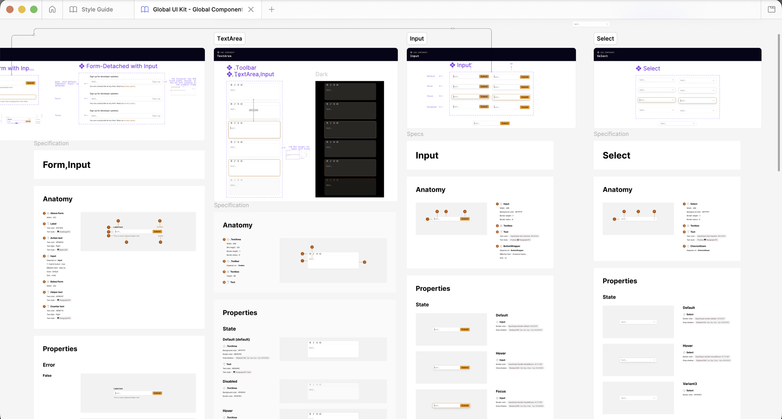
Inside the Figma library — five captures from the system at full depth.

Inside the Library

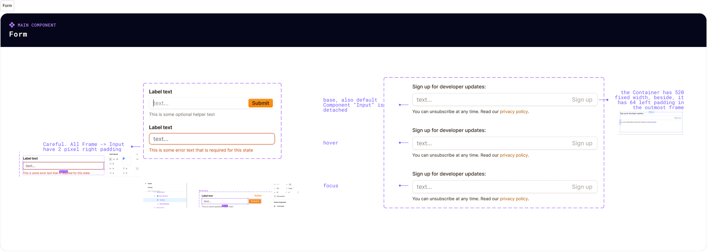
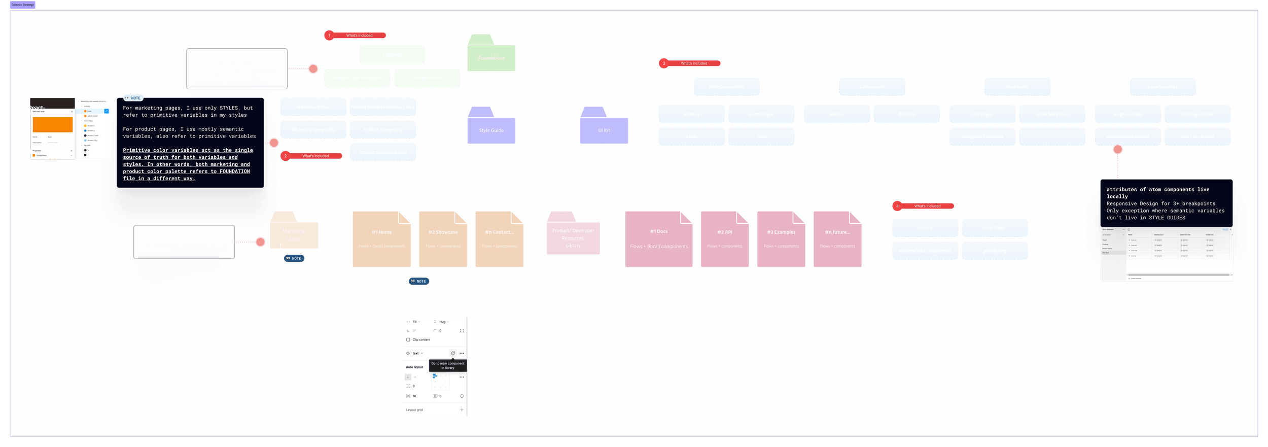
Figma library structure: adaptability over robustness

In order to communicate more effectively with developers inside of Figma and keep design files hygienic across the team, I followed a consistent naming convention and file organization — streamlining the developers' handoff process.

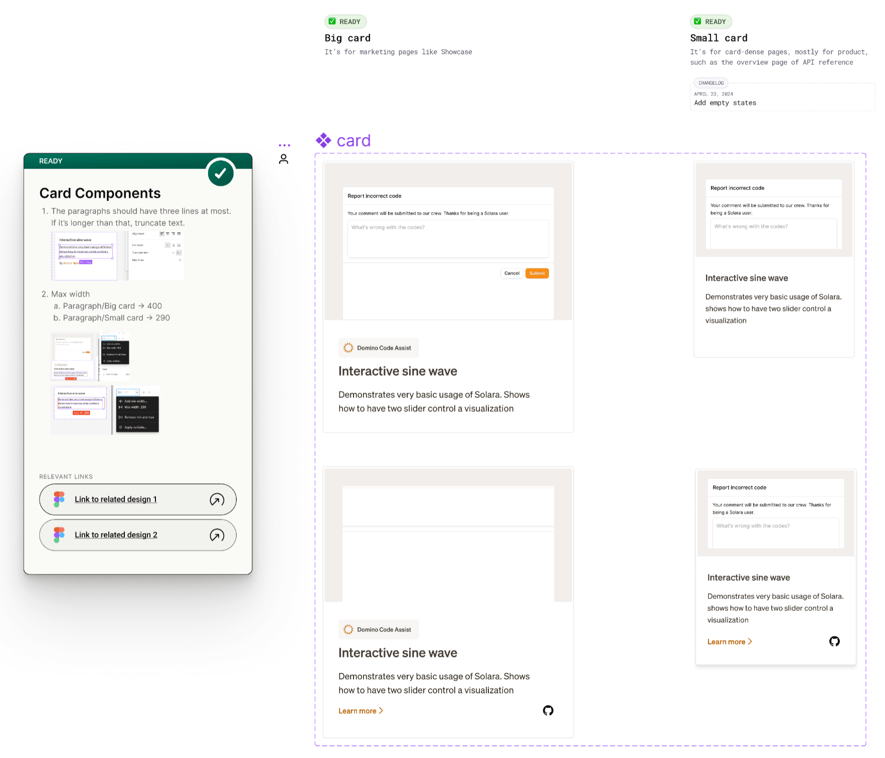
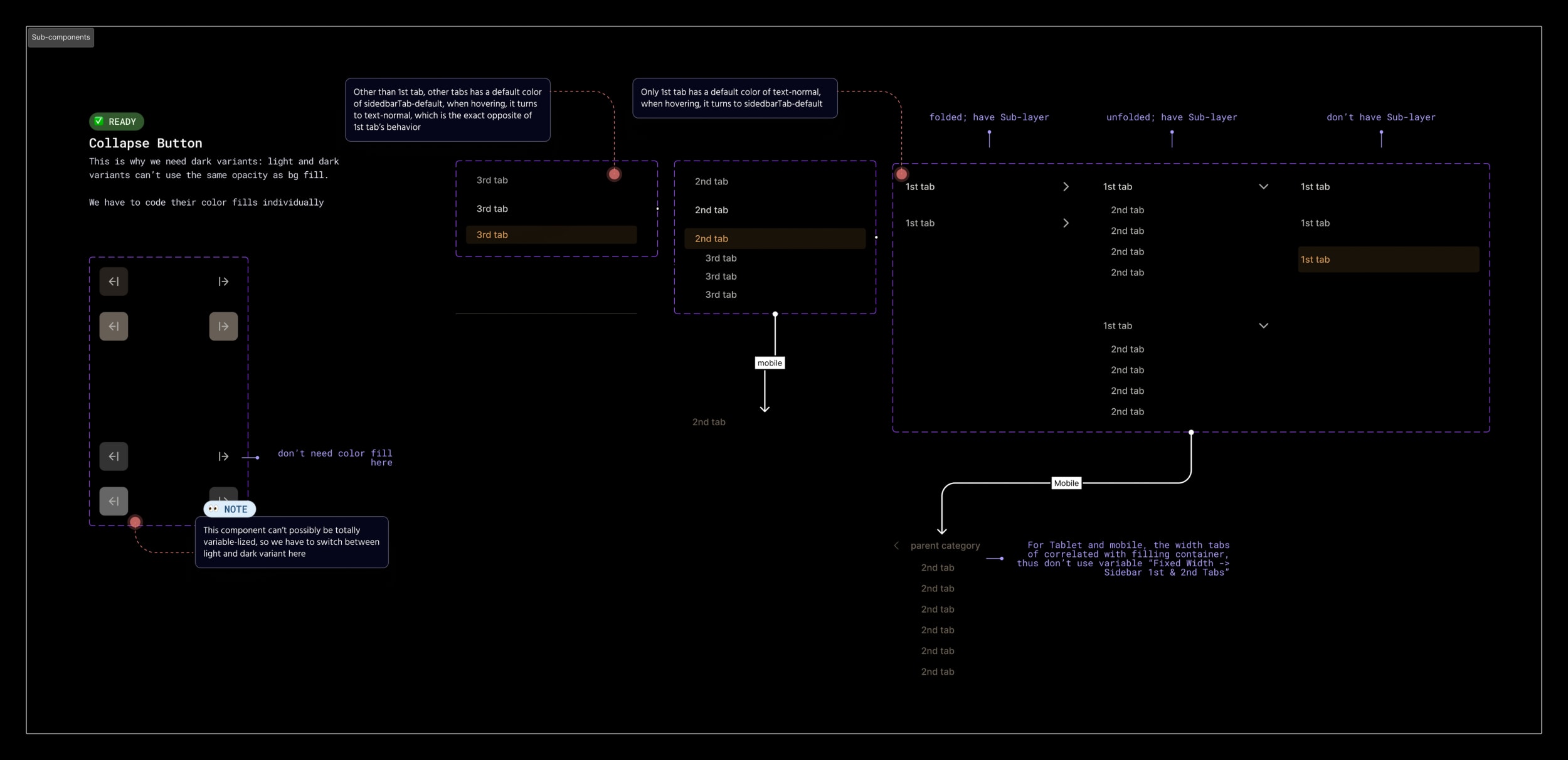
Component specs lived on the canvas, next to the components they governed. The card family is a good example: a Big card for marketing pages like Showcase and a Small card for card-dense product pages like the API reference overview, each with a hard max paragraph width (400 vs. 290) and a three-line truncation rule. Status chips marked what was READY, changelogs recorded revisions, and every spec linked out to its related designs — so a component was never just a rectangle without context.

Component Spec on Canvas — Card Family
Figma canvas spec for the card component family — Big card and Small card variants with READY status chips, max-width rules, truncation guidance, changelog, and related-design links
Design Documentation Sample in the Handoff Process
Design handoff documentation
Strategies for Setting Up Figma Libraries
Strategies for setting up Figma libraries

Design Operations

Maintain a "single source of truth"

Organizing team tasks in one place

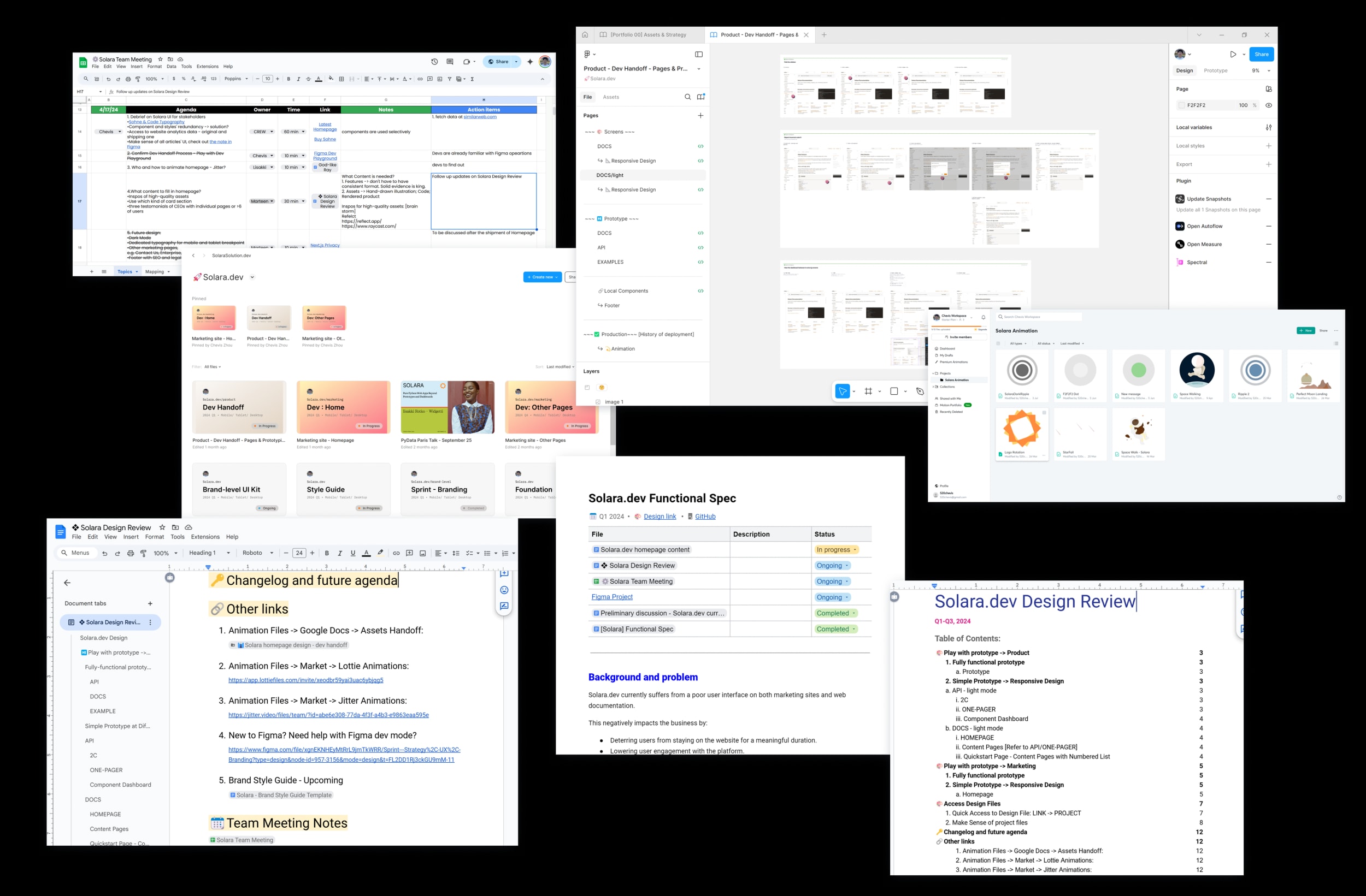
To maintain a single source of truth, we used a queue in Google Workspace. It managed idea generation for team meetings and cooldown periods, kept a record of critique guests, and rotated note-taking responsibilities. Anyone could open the queue at any point in the week, and we groomed it during Slack morning warm-ups when scheduling the weekly meetings — keeping it in one place made it far less likely we'd drop an action item.

Design Operation Overview
Design operation overview
A living design review doc engineers actually used

The same single-source-of-truth discipline extended to the files themselves. A standing design review document gave engineering one entry point to every prototype (each at all four breakpoints) and every design file — with the file architecture spelled out: PLAYGROUND and SPRINT files were explicitly out of dev scope; DEV HANDOFF files were where all final pages lived; a Foundations file held the color and size primitives as the single source of truth behind the style guide. Inside files, ALL-CAPS pages signaled prototypes. Engineers always knew which file to trust.

Design operation streamlined

Toolkit: Figma + Framer + Google Workspace + Storybook + Maze + Slack

I set up well-structured and documented Figma files, streamlined UI development with Storybook, managed tasks through Google Workspace, conducted research through Maze and FigJam, and ensured clear communication via Slack channels.

Sample Dev Handoff: Flow
Sample dev handoff: flow
Sample Dev Handoff: Components
Sample dev handoff: components
Testimonial

I had the pleasure of working with Chevis at Solara for over a year, much of that time as his direct manager.

Chevis is an excellent Product Designer who consistently met and exceeded expectations. He worked on various parts of the product, notably taking the initiative on the homepage and API documentation redesign. He effectively handled complex challenges and consistently delivered high-quality results. His strong understanding of user needs and his focus on impactful features rather than just flashy designs made him stand out.

In Solara's fast-paced startup environment, Chevis's adaptability and eagerness to contribute wherever possible were invaluable. He was always willing to step up and take on new tasks, demonstrating a great capacity for learning and growth. Beyond his professional skills, Chevis brought positive energy and a collaborative spirit to the team, making him a joy to work with and fostering a positive work environment.

I highly recommend Chevis. His exceptional design skills, strong work ethic, and positive attitude would be a valuable asset to any team.

Bobby Liu
Bobby LiuSenior Product Manager, Solara

Validation

Validate early, ship with confidence.

The documentation redesign wasn't judged on mockup polish alone — it had to survive developer scrutiny and engineering constraints before anyone committed to build.

I ran the API reference prototype through structured review cycles with engineering and product: navigation taxonomy, component page scaffolding, and handoff specs were pressure-tested against how Solara developers actually search for functions. Feedback from the beta-launch survey and discovery interviews informed which pages to prioritize — Quickstart, component reference, and GitHub contribution paths surfaced repeatedly as friction points, and the IA was adjusted before pixels were finalized.

By Q2, the prototype was presented at an all-hands. Stakeholders responded positively — the team wanted to start building immediately. The 100+ component design system gave engineering a shared vocabulary inside the design file: every screen mapped to a documented Figma component, which cut back-and-forth during implementation. The Storybook pipeline was built and working — what never followed was volume. Only a small share of the library made it through it: the components engineering could implement cheaply landed, and the rest stayed in Figma. WCAG 2.1 AA was validated across CTAs and core information in the design.

What survived the trip into production was the part that mattered most for adoption: a documentation portal developers could navigate, with a taxonomy that told them where they were and where to go next.

Testimonial

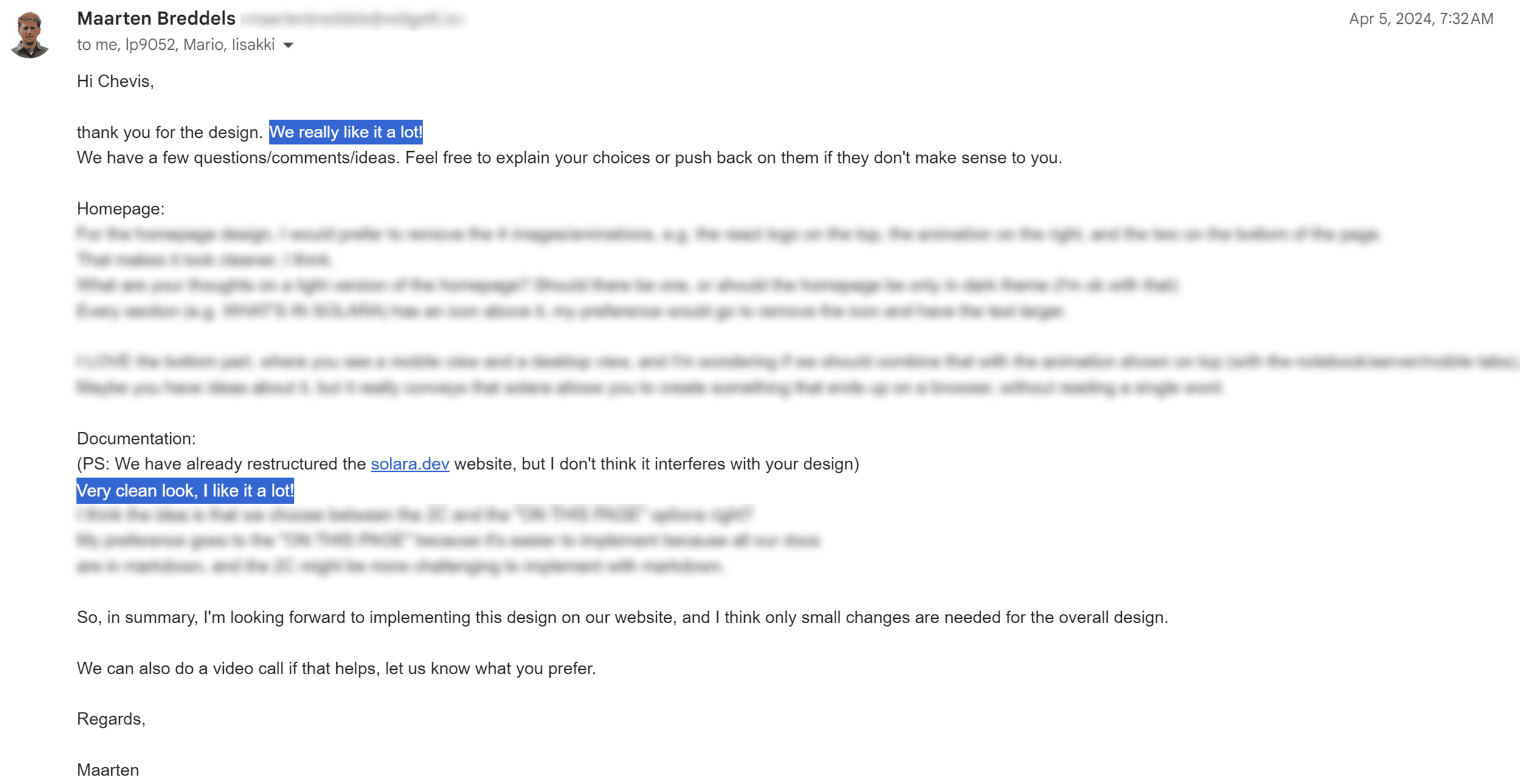
Very clean look, I like it a lot!

Maarten Breddels
Maarten BreddelsCo-Founder, Solara — documentation design review, Apr 2024
The design review email, Apr 2024 — “Very clean look, I like it a lot!”
Design review email from Maarten Breddels, April 2024, praising the documentation design

Outcome

Collaboration is key.

Every Q1 design OKR was met. The build didn't follow all of them.

The API reference prototype presented at the all-hands became the build plan, and the portal's information architecture and taxonomy shipped as designed. After launch in Q4 2024 — one quarter after the marketing site went live — Solara reached 170,000 monthly downloads by November 2024. A downloads curve like that belongs to the whole product — the framework's engineering first — but the portal was the surface that growth landed on: the docs are where a referred developer decides to adopt. The visual system underneath is a different story, and the Design System section tells it.

Maarten announced the milestone publicly, positioning Solara as the framework teams reach for "as a replacement for Streamlit when an app grows larger and more complex" — and weeks later the wider ecosystem echoed it, with a Solara tutorial series landing on the official Jupyter Blog.

The North Star metrics we set during the design process — DAU, WAU, and monthly downloads — validated the strategy: the November milestone confirmed the growth trajectory rather than a launch spike. And the design met WCAG 2.1 AA across all CTAs and core information.

Referral traffic became the growth engine

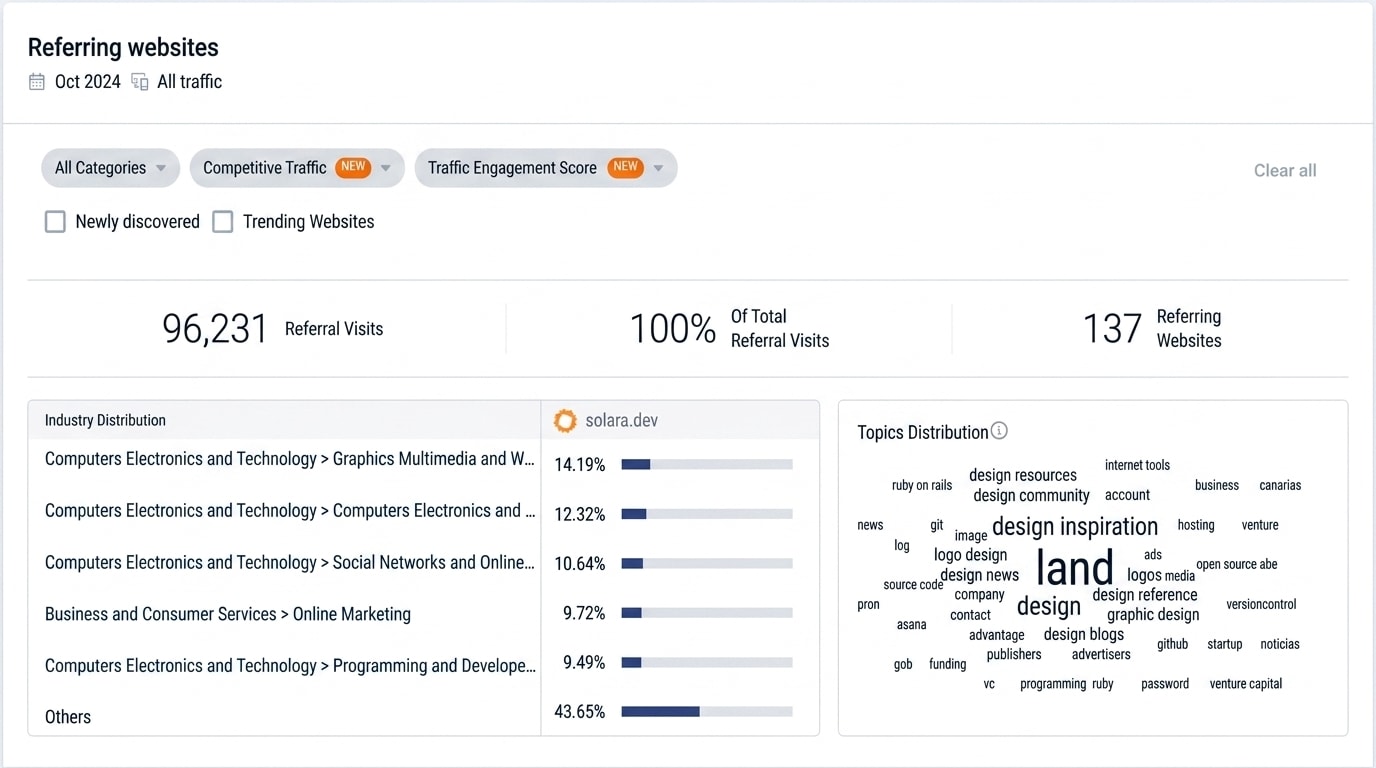
The functional spec bet that trustworthy documentation would attract users organically — Solara's own analytics bore it out. In October 2024 alone, solara.dev drew 96,231 referral visits from 137 referring websites, led by design communities, developer-software directories, and programming resources. Referred developers don't land on ad campaigns; they land on the documentation. The portal was doing exactly the acquisition job it was designed for.

Solara's Referral Traffic — Oct 2024
Solara's referral traffic analytics, October 2024 — 96,231 referral visits from 137 referring websites, led by design and developer-software categories
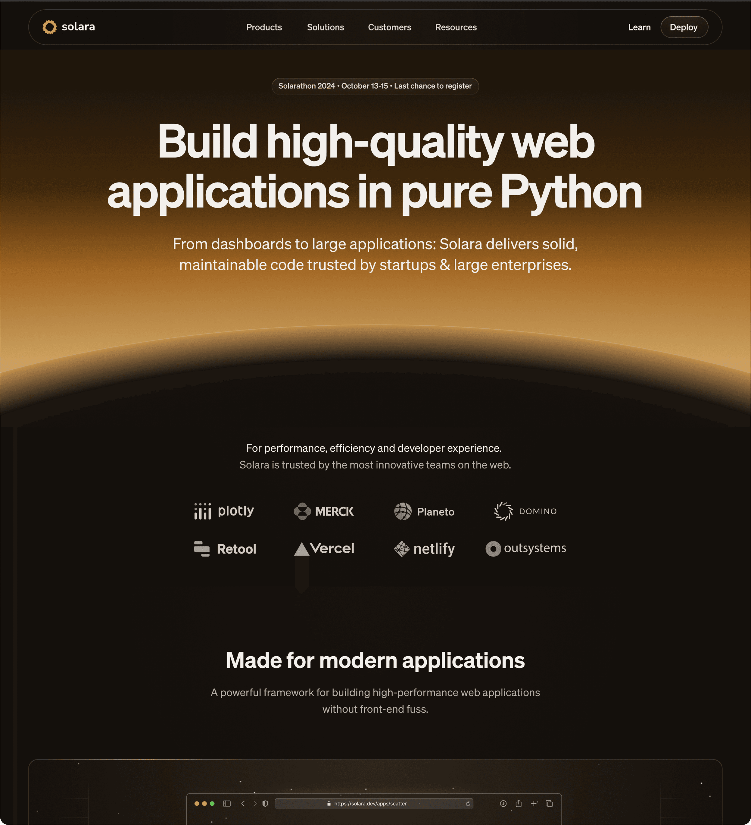
The marketing homepage design in dark mode — one sunrise identity carried across the product's public surfaces.
The Solara homepage design in dark mode — sunrise hero and Python value proposition
Testimonial

He took the initiative on the API documentation redesign and consistently delivered high-quality results.

Bobby Liu
Bobby LiuSenior Product Manager, Solara

Key Takeaways

Cross-functional partners should be involved as early as possible

It fostered a holistic approach to the project, where content strategy and technical limitations were considered in tandem.

Scope in writing, then defend the scope

The functional spec's non-goals mattered as much as its goals. Ruling out content rewriting up front kept the redesign shippable — and the risk register (GitHub-first users, snippet errors, report abuse) meant launch-week surprises had already been designed for.

Design with Soul

Even the most mundane products deserve a touch of soul. Documentation can shine too. I infused the web documentation with thoughtful details that conveyed our brand's trustworthiness. It's about communicating that our framework is a reliable foundation for building and running software.

Nurture the Ecosystem

Growing a product is like gardening. You nurture the ecosystem, trust the process, and know when to prune and plant new seeds. The fruits will come naturally. We built trustworthy documentation to attract users organically, reduced costs, and showcased our commitment to support.

Related Work