 AethrDesign: Team-shaped work from a practice of one — because AI executes the build.
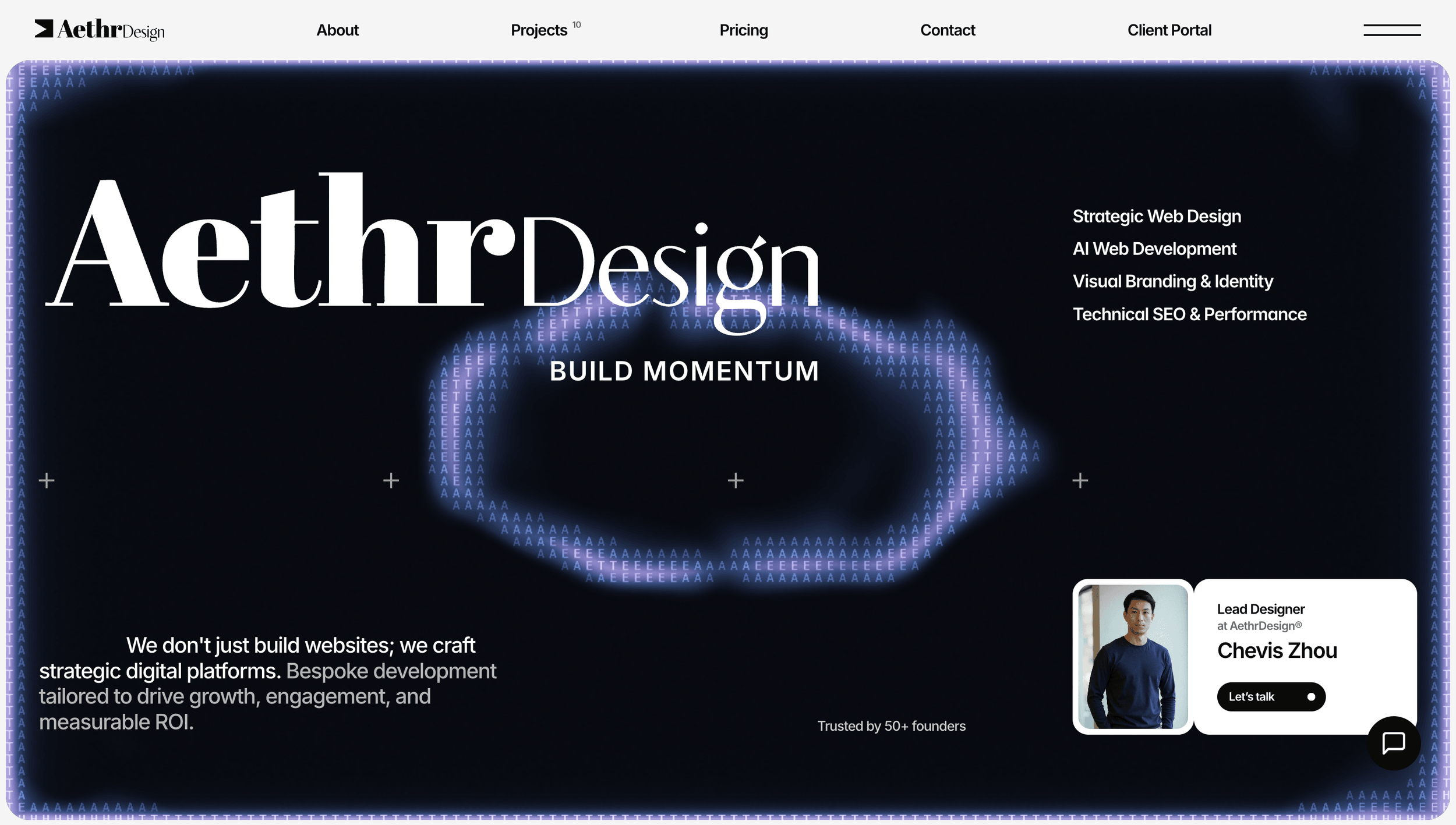
AethrDesign is my one-person web practice, run since August 2025 on a simple argument — you no longer need a team of designers and developers to ship great digital products. One person directing AI can carry strategy, design, code, and client operations end to end. The work below is the proof, and some of it is running live on this page.
Overview
You no longer need a team to ship team-shaped work.
The ground under digital product work has shifted. The parts of an engagement that used to demand headcount — production design, front-end build, revisions at volume — are exactly the parts AI now executes well, if someone architects the context it works inside. That someone is the new job. AethrDesign is my working test of that argument: one person carrying an agency's full surface — positioning, design, engineering, client operations — by directing AI through every build and keeping human judgment at the points where it actually matters.
This study is organized as evidence, not memoir. The claims in it are countable and inspectable: repositories you can open, sites you can visit, analytics I own the instrument for — and deliverables running live in this page.
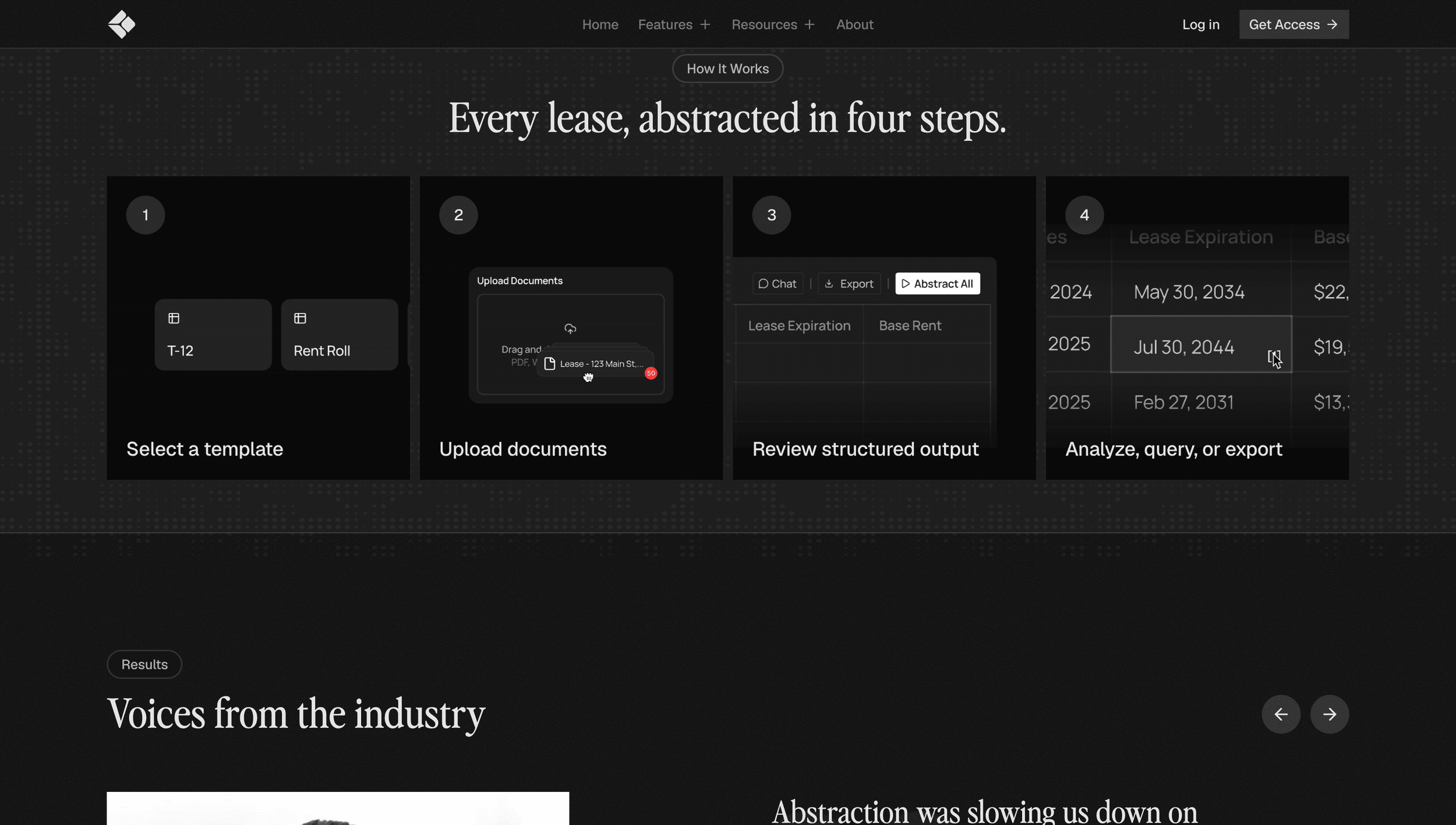
Below is the first one. These four cards are not a recording of the deliverable — they are the shipped "How Rets Works" animation set I delivered to Rets AI, the same vector files the client's site serves, playing here through their own runtime. Click one and it pauses. A screenshot can't do that.
The Practice
Hand-built on Framer, twelve weeks at a time.
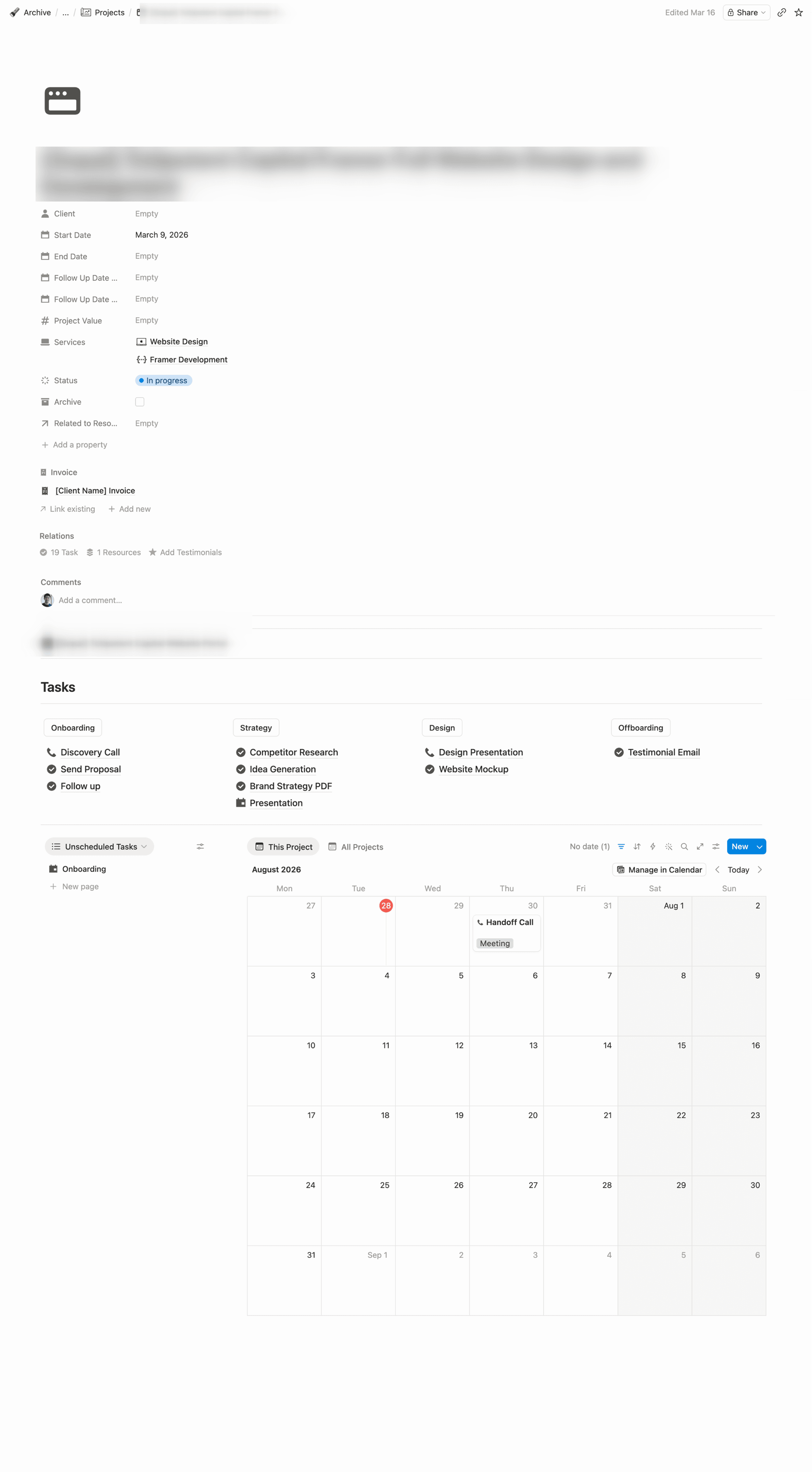
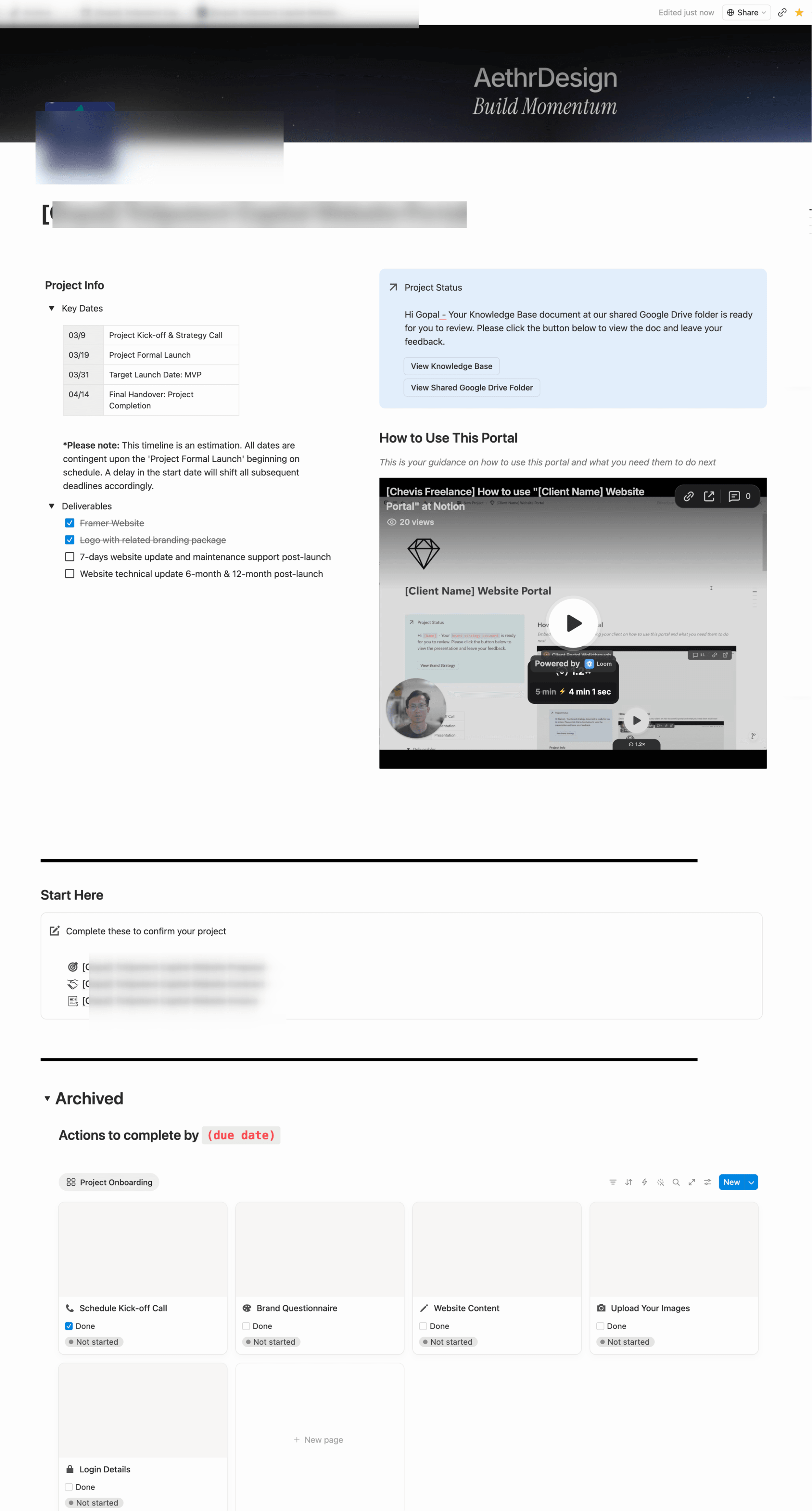
Before the rebuild, AethrDesign worked the way most small studios do. Every site was hand-built in Framer, and a full engagement — discovery, design, build, launch — ran on the order of twelve weeks. The business itself lived across Notion and Google Drive: client portals, kickoff checklists, deliverable trackers, handover docs, each maintained by hand.
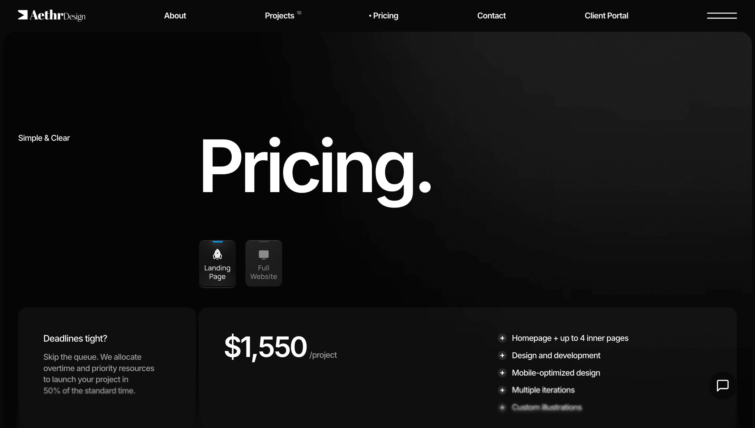
That operation was real and it worked — clients across SaaS, e-commerce, creators, and professional services, an approval as an official Framer Expert in 2025, and posted public pricing rather than quote-on-request. But every part of it scaled with my hours and nothing else.
Left: The internal project page — dates, deliverables, tasks.
Right: The client-facing portal, with a walkthrough video per project.
The Tools
I build my own instruments — and iterate on them the way I iterate on client work.
What makes the practice AI-native isn't that AI writes code — it's that the operation itself is tooled. I run a 56-skill agent operation: 30 skills I authored, 26 installed from the ecosystem, with 13 of my own published open-source under MIT. Each skill is a deterministic, versioned procedure — the value isn't the prose, it's that the same job runs the same way every time. The whole graph is visualized interactively in my lab.
The part the public repository deliberately withholds is the AethrDesign lifecycle cluster: eight private skills that carry a client from first contact to handover — onboarding, kickoff questionnaires, proposal generation, client email drafting and triage. Those skills produce real client-facing artifacts; the Maxematics client portal is a public, read-only instance of the system they run through.
This study was itself produced by that tooling. The map below is the actual planning graph the work ran on — twenty-one tickets orbiting one destination, worked one decision at a time.
Decisions closed — 12/21
Frontier — 9 open
21 tickets · 12 decided · 9 open
Hover a node — or any ticket either side — to read the decision it holds.
01Publishability, naming & metrics auditDecided
No NDA exists anywhere, so naming is unrestricted — but no evidence exists for any client-attributed metric either. The study carries almost no client percentages.
02Live-embed feasibility proofDecided
Three real client deliverables ran live inside an MDX page for 3.7 KB gzip and zero CSP changes. Three exhibits is the ceiling before it reads as a demo reel.
03Asset inventory auditDecided
297 archived files actually opened and graded: 7 hero, 16 supporting, ~205 cut. The disk counts are a floor, not a census.
04Story-recovery briefDecided
The spine got a date and an honesty boundary — a five-week rebuild, and a productized tier that has never run a paying client.
05Lock the narrative outlineDecided
Seven sections, thesis first, opening on live proof. Two quotes, three stats, and no re-dating of anything — dates ship as they are.
06Staged pipeline captureOpen
Record the two gates and the full assembler run so the guards can be inspected rather than described.
07Live-property recaptureDecided
Fresh 2× captures of every live property. The first pass ran GPU-disabled and silently dropped the hero's particle glow — caught on review, recaptured.
08Owner fact verificationDecided
Retracted an $11k component-library figure as untrue, and omitted one real engagement for lack of surviving assets — an evidence gap, not a credibility one.
09Testimonial sourcingDecided
Seven verbatim, already-public quotes exist — all in the Framer CMS, not in email. Three clients have none at all.
10Productionize the live-exhibit blockOpen
Promote the live exhibit from a throwaway route into the real MDX block grammar, with its own stage and rail annotation.
11Rets AI animation source recoveryDecided
The four motion components came back clean and run live for ~8.9 KB gzip. Vendoring costs two mechanical import rewrites and no logic edits.
12The design-system claim and substituteDecided
A component inventory has depreciated to near-zero signal; constraint design has appreciated. So the beat is what I hand off changed — never the credential.
13Rets live exhibits — defect fixesDecided
The two code components had genuine deliverable bugs, so the exhibit ships as the client's own shipped Lottie set instead. Three silent runtime bugs fixed on the way.
14Maxematics live-URL swapOpen
Both Maxematics surfaces still point at staging. Swap to live domains once they publish.
15Demo-to-real-client swapOpen
The pipeline section admits no paying client has run through it. This ticket rewrites that paragraph the moment one does.
16Case-study portal instancesOpen
Stand up a public, tokenless, read-only portal instance for every client the study links as an example.
17Align the Maxematics CMS entry to the ladderOpen
Every surface has to tell the same v0 → v1 → v2 story at the same one-time $500 — the CMS entry, the portal fixture, and this page.
18Narrative asset productionOpen
Produce every exhibit the locked outline calls for — including anonymizing the operations captures and cropping the gate recordings.
19Author the study (MDX)Open
Write the seven sections against the locked outline, with each exhibit placed as a page-level sibling block.
20Cynthia testimonial finalizationDecided
Confirmed final with no revision cycle — the reply already carried the right attribution and dropped a clause that was factually wrong.
21Audit + deployOpen
One optimization and verification pass against the finished set, then ship.
The Machine
The part where AI does the work — and the two gates I kept.
For small service businesses, I productized the build itself: a $500, one-time tier where a structured brief becomes a deployed site. The machine is a spec-driven assembler — a JSON spec validated against a schema, compiled into a typed Next.js codebase, built and deployed through standard staging. The middle of that pipeline is built and verified; the intake and QA ends are still process I run by hand, wired to tools that already exist. I've deliberately kept two human gates: I read and edit every spec before it builds, and I review every build before a client sees it.
What makes the machine trustworthy isn't one validation layer, it's two, each catching what it's actually good at. The schema knows what a section is — hallucinate a section type that doesn't exist and the spec is rejected before it touches the codebase. The compiler knows what a section needs — omit a required field and next build names the missing props, the file, and the line. Neither gate duplicates the other's work, and both failures are reproducible on demand.
The honest caveat comes before the footage: no paying client has run through this tier yet. What follows is a demo — the machine executing the Maxematics brief end to end, recorded so the gates can be inspected — not a record of a productized engagement. The moment a real one lands, this paragraph changes.
Run on Real Content
A machine isn't finished until real copy has been through it.
The sample specs all passed. The real brief didn't — and that's the point. The first time the assembler ran actual client copy, a mission statement containing an ordinary double quote generated a syntax error and two of five pages failed to compile. Every sample spec had been quote-free, so the defect was invisible until real content arrived. It's fixed, and it permanently changed how I judge the tier: a testimonial, a quoted phrase, the most ordinary content a small business has — that's the real test suite.
The run below is the full pass on the Maxematics brief: five pages assembled from one spec, TypeScript green, nine routes prerendered.
The Ladder
One brief, three levels of autonomy.
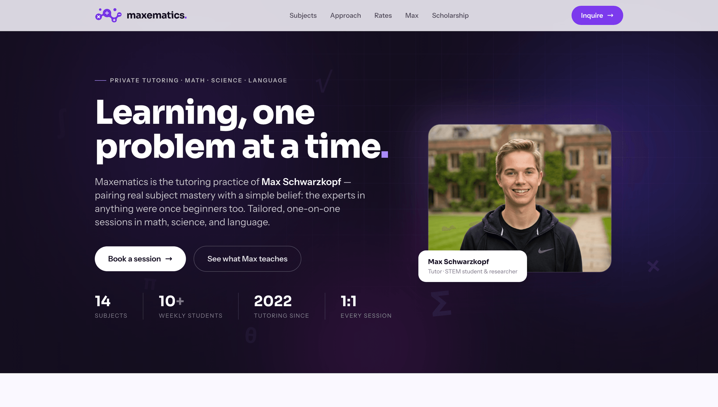
Maxematics — a private tutoring practice — is the same brief resolved at three levels of machine autonomy, and the clearest picture of how the tiers relate.
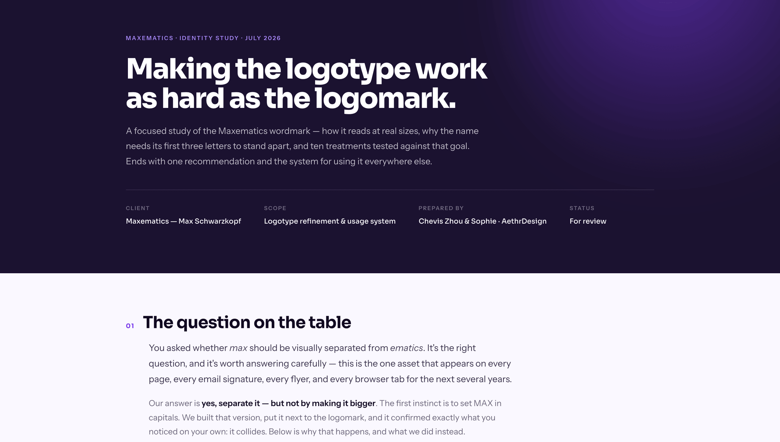
v0 is the assembler's own output: the recorded run above, competent and correctly themed, kept local as the machine's benchmark. v1 is the $500 productized build — hand-directed AI, custom-coded, delivered and live. v2 is where the engagement went next: the client upgraded to a bespoke rebuild with a branding revamp, including a focused logotype study now awaiting sign-off. A client who bought the entry product and grew into bespoke work is the tier structure doing exactly what it was designed to do.
The staging links here swap to the production domain when v2 ships — tracked, not forgotten.
Testimonial“Working with Chevis completely transformed my son's online presence. He didn't just redesign Max's old site; he had the vision to reframe it into a modern, science-forward portfolio that perfectly highlights Max's STEM research and engineering background. The design quality is incredible—clean, mature, and exactly what we need for his college and internship applications. On top of that, Chevis was incredibly efficient. He built a lightning-fast, custom-coded site from the ground up and delivered a polished brand faster than we expected. We couldn't be happier with the result.”
Cynthia SchwarzkopfMaxematics (Max's mother)
Rets AI
The proof, across three disciplines.
Three engagements carry the range: a SaaS product's motion system, a creator's conversion platform, and an e-commerce brand's storefront.
Rets AI — motion as product explanation
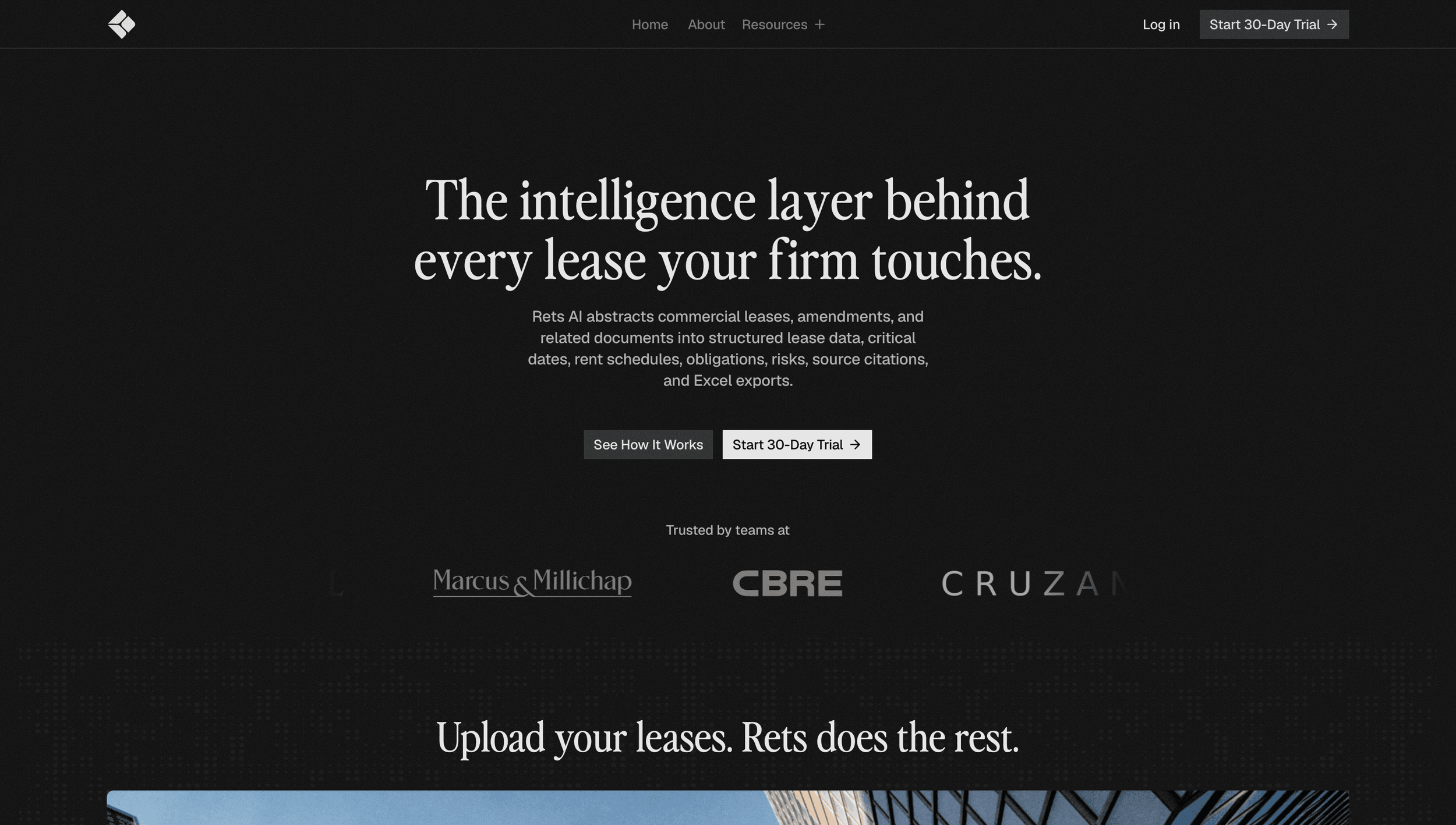
Rets AI abstracts commercial leases into structured data. For a product whose value is a workflow, the marketing site's job was to make that workflow legible in seconds — so the centerpiece became the four-step "How Rets Works" sequence: one continuous narrative from template selection to export, built as four coordinated animations. That's the set running live at the top of this page; below is where it ships in the wild.
Ruri Ohama
A creator site that became a conversion platform.
Ruri Ohama is a YouTuber with 1.47M subscribers; the engagement rebuilt her web presence around selling her Kaizen System productivity product. My role was visual design plus the AI-assisted business side — positioning, page structure, conversion flow — over a twelve-week engagement in 2025.
This is the one client outcome in this study backed by an instrument I own: the site's Google Analytics property runs on my account. From September 2025 through May 2026 it recorded 54,000 active users and 108,000 new users. Her investment paid for itself many times over — here's the traffic, and here's her saying so.
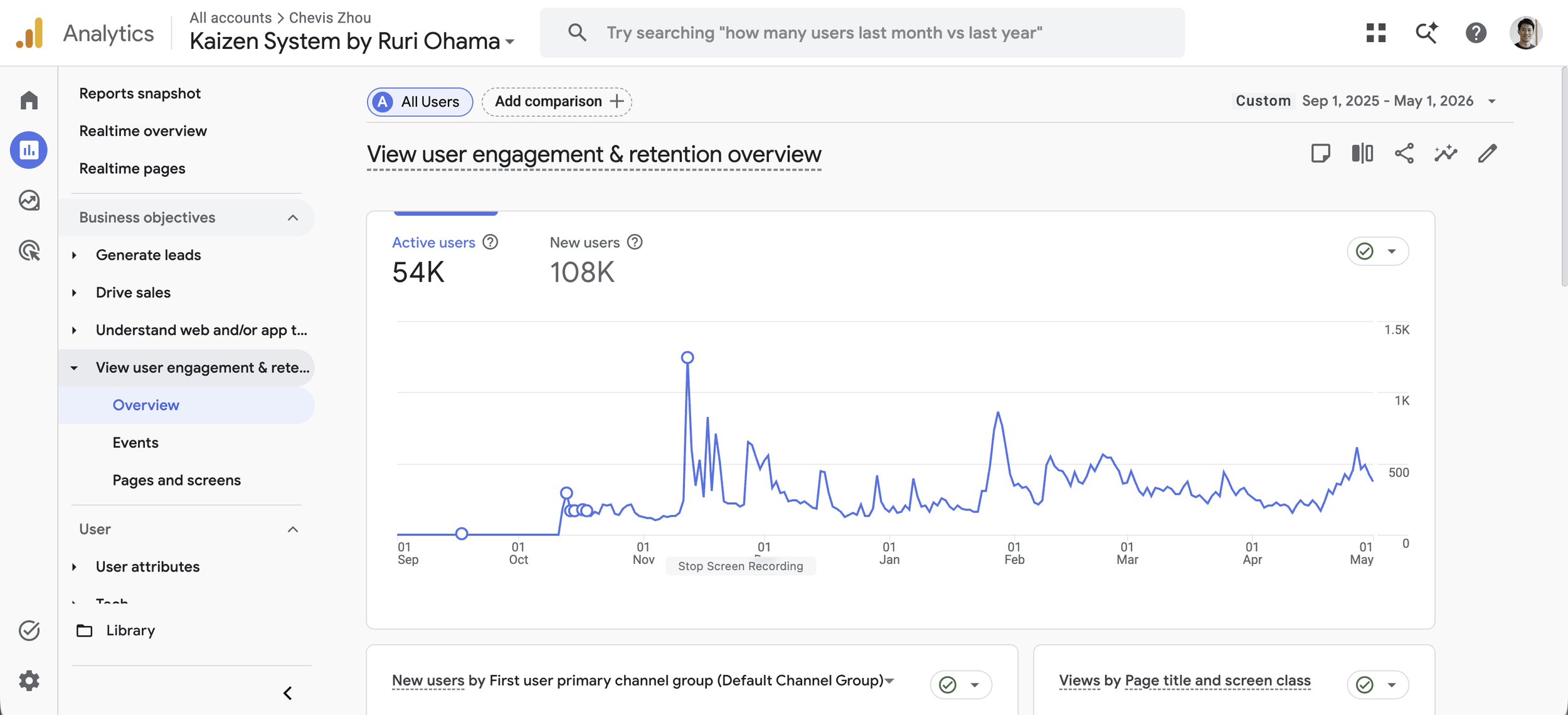

Testimonial“Chevis transformed my ideas into an amazing website and working with him was super smooth and easy. He was deeply invested in my project, often more than I was! He truly understood what I needed and made my ideas even better than I expected… I'm excited to work with Chevis on future website projects and strongly recommend him.”
Ruri OhamaCreator, Kaizen System — 1.47M YouTube subscribers

Live Love Pop
Platform range — Shopify, developed like software.
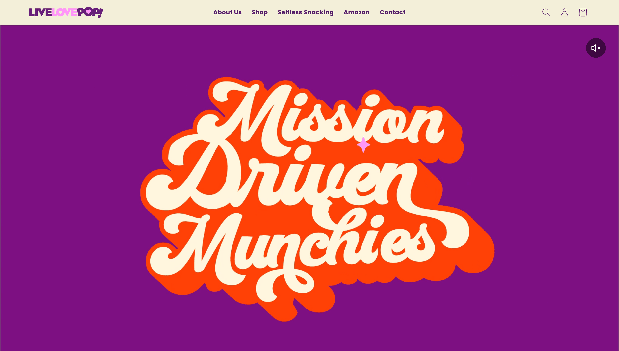
Live Love Pop is a healthy-snacking brand whose storefront runs on Shopify. The engagement was theme development done with a local CLI toolchain — versioned, previewed, and shipped like any other codebase rather than edited live in an admin panel. It's the smallest unit in this study, and it's here for exactly that reason: the practice's range runs from vector motion systems to e-commerce plumbing without changing how the work is run.
What Changed
What I hand off changed.
The compression is personal, not mechanical. Engagements that ran twelve weeks when everything was hand-built now run one to four — and the cause isn't the pipeline, it's that I got better at directing AI: tighter briefs, better context architecture, faster judgment about what to accept and what to redo. The machine section above automates one tier; the capability curve belongs to the operator.
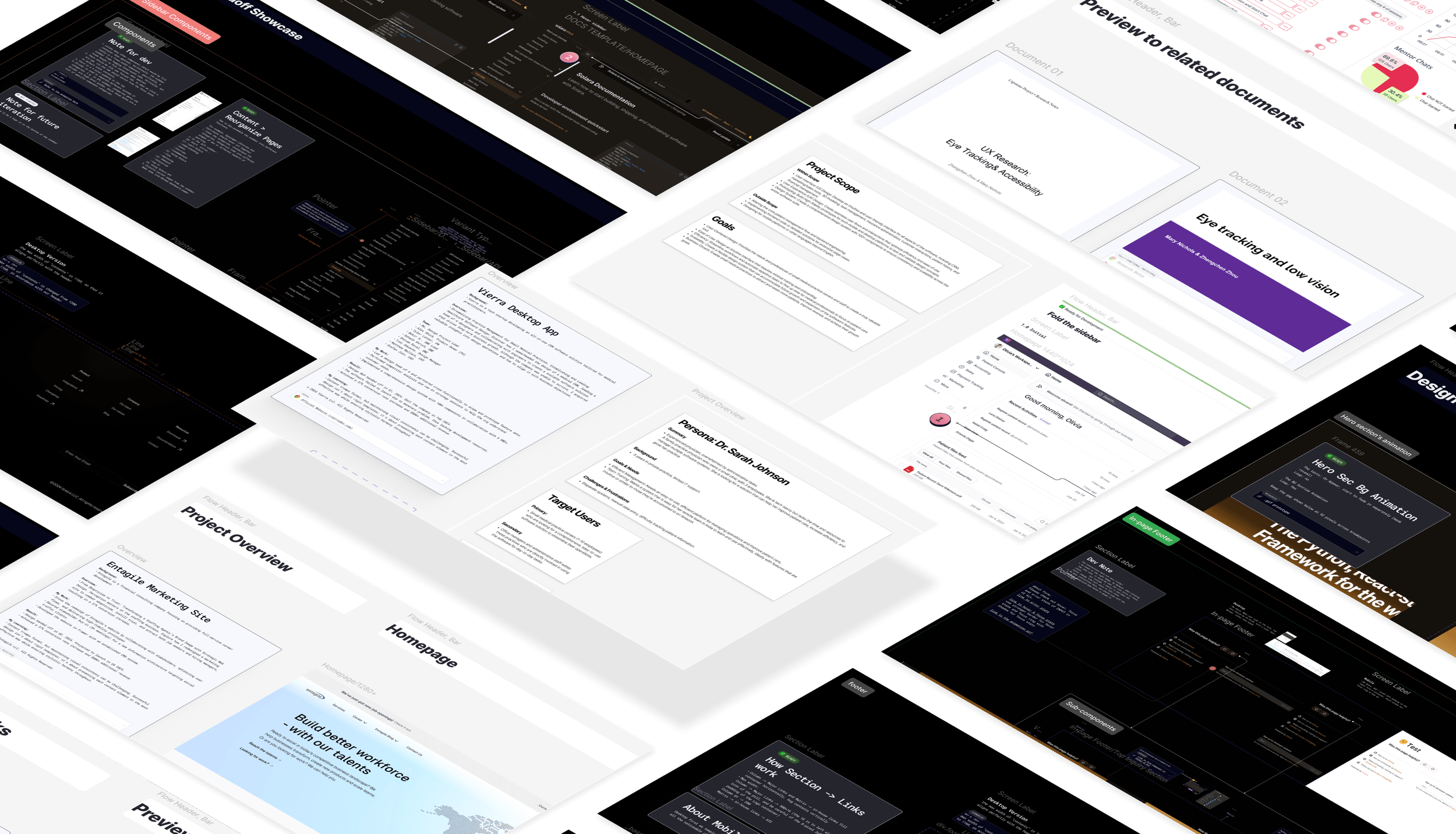
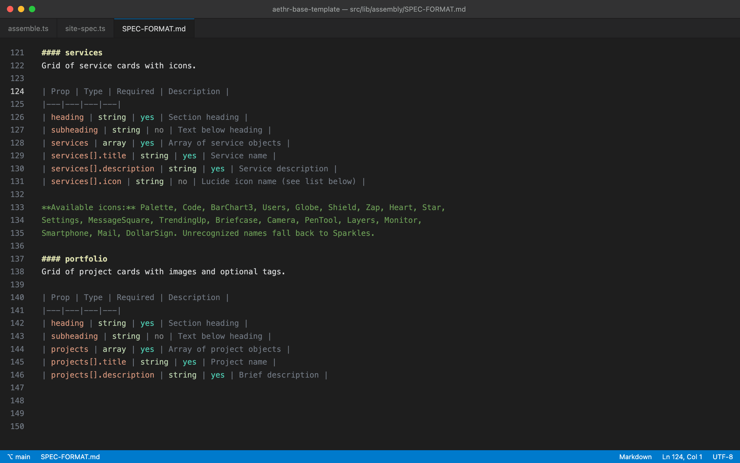
The clearest artifact of that shift is the handoff itself. I used to annotate Figma canvases for a developer — screen labels, dev notes, ready badges, a vocabulary built for a human reader. Now the densest document in the practice is a 284-line spec format written for a model to read: constraints, vocabularies, prop contracts. Same job — transferring intent without loss — different reader.
Top: What I used to hand a developer — annotated canvases from my earlier product roles.
Bottom: What I hand off now — SPEC-FORMAT.md, 284 lines written for a model.
- 1–4 wkPer engagement now — the same scope ran ~12 weeks when every build was by hand
- 56Skills in the operation — 30 authored, 13 published open-source
- 54kActive users on a client property, measured on an analytics instance I own
Where It Stands
The machine is built, verified, and recorded — and it's waiting for its first productized customer. I could have left that sentence out; the study is stronger with it in. The argument here was never that automation has already replaced the team — it's that one person, directing AI with judgment and keeping the gates that matter, can now do team-shaped work at agency quality. Everything above is that argument, running.