This is drawn from a 2022 redesign I did for Mentor Buddies, a mobile app by Design Buddies, one of the largest design communities, that matched members with expert mentors for short private chats in exchange for a small donation to the mentor's chosen charity. The app had already been through a beta test. The completion rate for onboarding was 1.9%.
Not retention. Not conversion to paid. Onboarding. Ninety-eight of every hundred people who wanted mentorship gave up before seeing a single mentor.
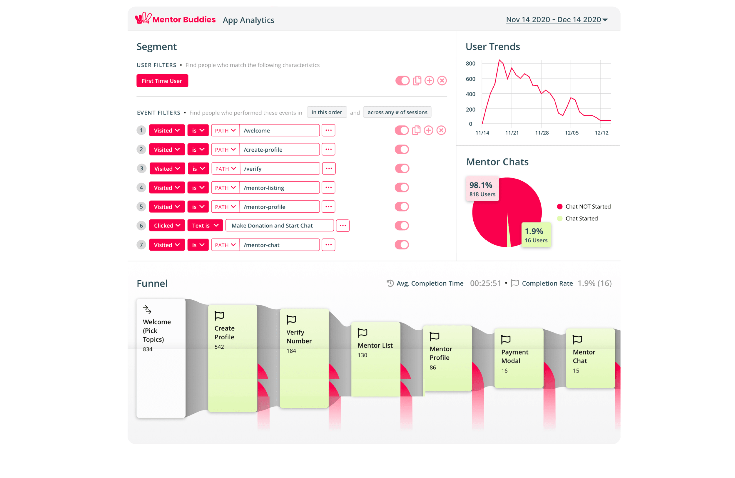
Finding where they left
The analytics gave us the where before the interviews gave us the why. Three screens accounted for most of the bleeding: the welcome screen lost 35% of arrivals, profile creation lost 66% of those remaining, and the mentor list lost 66% again.
To understand the why, I interviewed eight community members and ran affinity mapping on their feedback in FigJam — every comment tagged to the screen it referred to, then clustered into themes. Four pain points survived the clustering:
- Users weren't invested enough to hand over personal information at account creation.
- The welcome screen was a wall of text; people couldn't tell how the app worked.
- The mentor list was overwhelming.
- Matching felt neither accurate nor personal.
The first one is the one that matters, because it isn't a UI problem. It's a sequencing problem. The app was demanding commitment — a filled-out profile — before it had demonstrated any value. Users were being asked to invest in a product they hadn't seen yet.
The uncomfortable fix
The instinctive response to a failing profile form is to improve the form: fewer fields, better copy, progress indicators. We did some of that. But the change that actually addressed the pain point was structural: an alternative path that skips profile creation entirely and drops the user straight into the mentor list.
This was not an easy sell to stakeholders: a profile is data, and data feels like the business model. The argument that won was the same data pointed the other way: a 66% drop-off on that one screen meant the profile requirement was destroying two-thirds of the funnel to protect information we could collect later, from users who by then had a reason to give it. Once someone has browsed mentors and wants to book a session, the profile stops being a toll booth and becomes a natural step.
The other fixes followed the same principle: show value before asking for effort. The text-heavy welcome screens became illustrations that explained the mechanic (expert chat, 15 minutes, donation to charity) at a glance. The mentor list got reviews, self-intros, and online-status indicators, so the value being promised was visible and specific rather than abstract.
Testing and the number
I sketched the new flow on paper — no more than two major interaction areas per screen — moved to a low-fidelity Figma prototype, and ran think-aloud usability tests with five participants whose task was to get from install to chatting with a mentor. The structure held; the flaws it surfaced were fixable details, not direction.
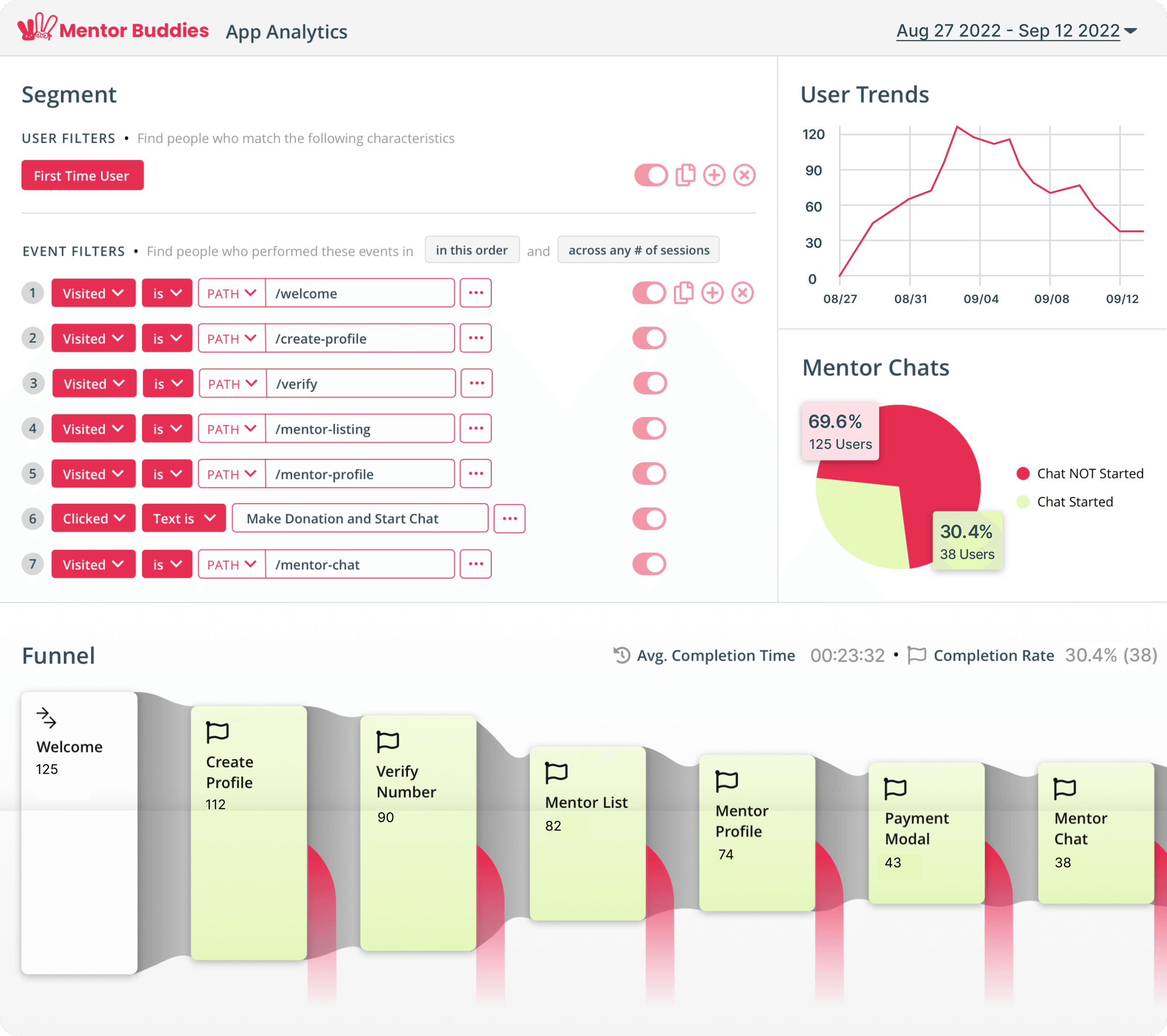
After development, the team ran a private beta with 125 community members. Onboarding completion went from 1.9% to 30.4%, a 16× improvement, with the previously fatal drop-off points resolved.
The full case study
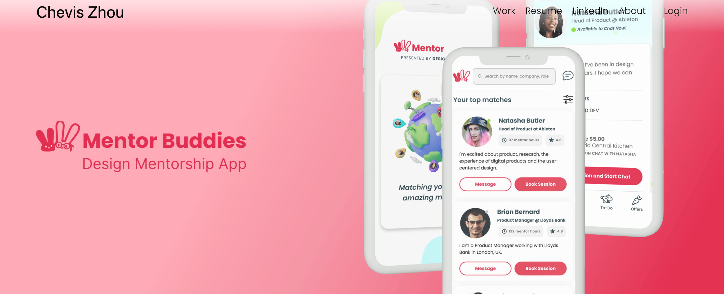
I've kept the original 2022 write-up intact rather than re-typing it here. It has the before/after screens, the revised user flow, the paper sketches, the affinity board, and the design-system documentation in full.
What I took from it
Drop-off data tells you where; only users tell you why. The analytics pointed at three screens. The interviews explained that one of them wasn't a screen problem at all.
The best onboarding step is often the one you make optional. Every mandatory step is a bet that its value to you exceeds its cost in abandoned users. At a 66% drop-off, that bet was losing badly, and moving the step later in the journey converted it from a barrier into a formality.
Designs survive contact with engineers only if engineers are in the room. With no PM on the team, I worked with the developers daily, designed edge cases on their request, and kept everything on an 8pt grid so consistency didn't depend on a design system we didn't have. The 30.4% belongs to that collaboration as much as to any wireframe.