Just a moment.
Q2, 2024 | Feature Scoping, Prototyping
My Role
UX Lead — Feature Scoping, Research, Interaction Design, Visual Design, Prototyping
Product Team Squad
Lisakki Rotko, SWE
Mario Buikhuizen, SWE
Maarten Breddels, PO
Pei Liu, PM
Timeline
Design Handed off in Q2 2024.
Launched in Q4 2024.
Overview
Solara, an open-source web development framework, empowers developers to create scalable, high-quality web applications using pure Python, prioritizing ease of use and maintainability.
Although we have a booming Github community with over 1800 stars, we lack a professional API Documentation to communicate our capabilities and support users, thus hindering the monetization.
I owned the design strategy for the API documentation project as UX Lead, and collaborated cross-functionally within a team of 5 to prototype and implement feature sets, thus 100+ design components have been integrated into the existing codebase, revamping in-house components.
We estimate reaching over 3,000 users, tapping into a total addressable market (TAM) of $10 million USD.
Highlight
Support the future of front-end development in the Python ecosystem — an API documentation for communicating Solara's capabilities and supporting users.
1.1a
Switching Light/Dark Mode Interaction
VIDEO
1.1b
Light/Dark Mode Homepage
INTERACTIVE
1.1c
Light/Dark Mode Modal
INTERACTIVE
1.2
API/Component Page Interaction
VIDEO
1.3
Footer Review Interaction
VIDEO
1.4
Left Pane Interaction
VIDEO
1.5
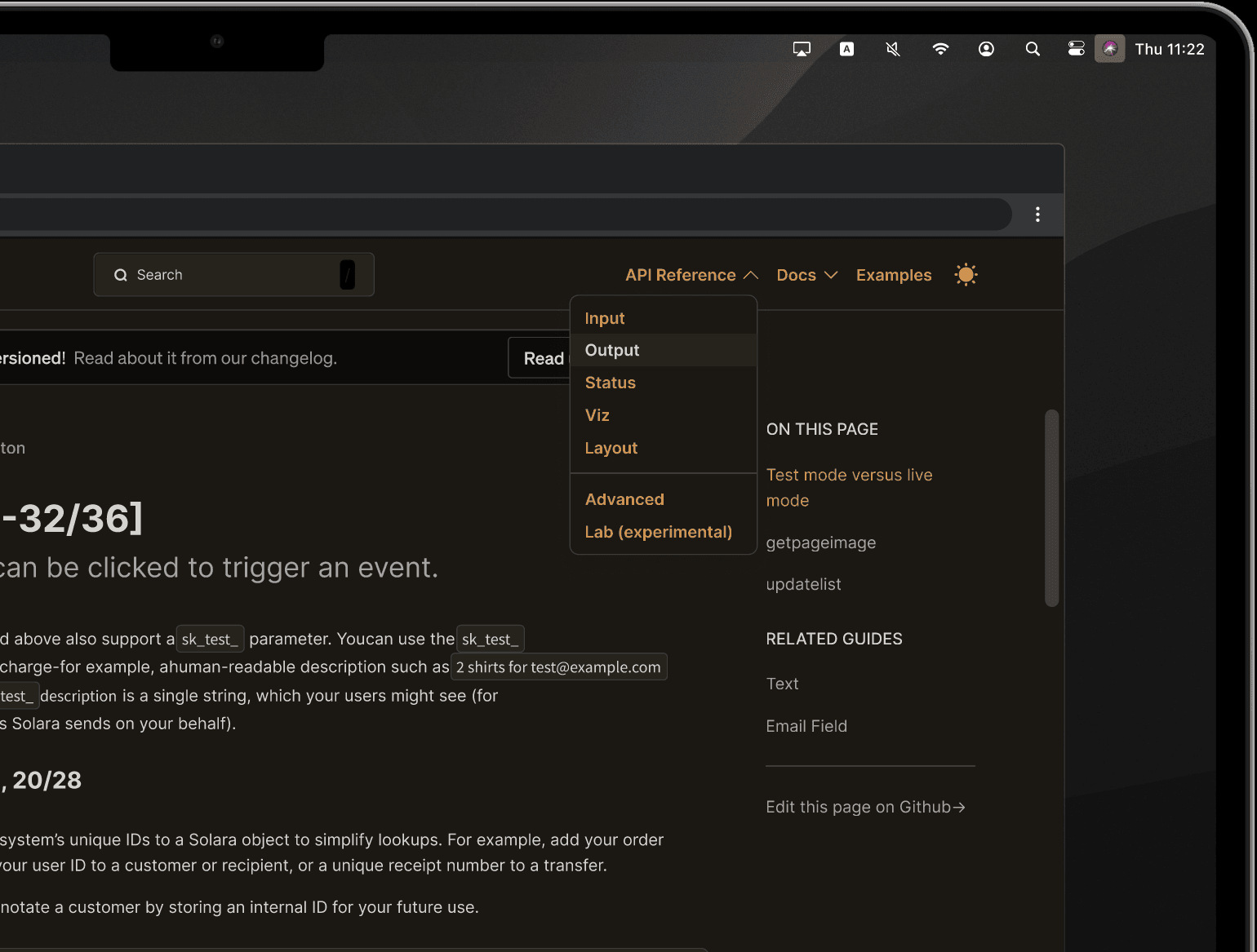
Top Navbar Layout
IMAGE
1.6a
Sample Dev Handoff: Flow
IMAGE
1.6b
Sample Dev Handoff: Components
IMAGE
1.7
Mobile Design
IMAGE
Context
Solara's mission: simplify front-end development
More Scalable Applications
Developers often struggle to efficiently transition data projects from Jupyter notebooks to scalable web applications due to the complex coding requirements involved.
Solara, a Python-based framework, simplifies this process, aiming to increase revenue to the tune of $5-10 million in just a couple years, and reach 30,000 developers.
2.1
Solara Homepage
IMAGE
Solara kicks off seed funding round
Widgetti is Solara's parent company, Solara is the major open-source library of Widgetti.
In Q4 of 2023, prior to me joining the design team as a contractor, Widgetti had a major update on Solara and was well-received.
As Solara rapidly matured, it became necessary to overhaul its website (Figure 2.1) and scale its design operation focused on selling enterprise licenses.
We did some research on our competitors, such as Next.js and Retool, and evaluated our total addressable market (Figure 2.2).
2.2
Market Size evaluation
IMAGE
Market size evaluation
Top-down: Starting with the $100 billion global software market, and narrowing down to Python/Jupyter users within the data science tools segment, the estimated market size is $10 million.
Bottom-up: Based on 2 million individual developers, with 50% in accessible markets and a 3% adoption rate, the potential is to reach 30,000 developers.
Problem Statement (Solara)
Python developers struggle to efficiently transition their data projects from Jupyter notebooks to robust web applications, missing a key opportunity to streamline development and broaden the reach of their work. Addressing this challenge could unlock an additional $10 million in annual revenue for Solara.
Problem Space (Web Doc)
Solara lacked infrastructure to sell.
API documentation was outdated
Developers struggled with Solara's outdated API documentation and insufficient technical support.
3.1
Solara scope
IMAGE
The goal of building a great documentation:
Drive business growth:
• improve credibility: showcase our commitment to support and how stable and reliable we are.
• attract users organically.
• cut overhead costs with training and support.
Improve developer experience (DX):
• smoothen the code review process: help developers identify and submit bugs to our GitHub Pages site.
• improve findability of Solara functions: help developers understand what they have to do in terms of project requirements, codebase, or current workflows.
• facilitate efficient onboarding of new developers.
• increase perceived software quality.
• reduce time-to-market for Solara products.
Emerging opportunities:
What if adding thoughtful details can communicate that our framework is a reliable foundation for building and running software?
What if the web documentation facilitated the integration of Solara with our parent company, Widgetti's products, nurturing the entire ecosystem?
Research
Clearing the fog — work backwards from developer pain points.
1. Interview users from our github pages
It was critical to first understand where the playtesting vertical fit in amongst the other pillars of standardized development lifecycles (Figure 3.0).
Based on historical user interview data, turns out, it was actually a (very messy) horizontal.
3.1
Before/After Homepage Hero Section
INTERACTIVE
3.2
Inspiration for Homepage Hero Section
INTERACTIVE
The card component's backdrop was a nod to the hero section's animation — featuring the Solara emblem (bgAurora) as a background fill against a foreground layer (before). When hovering, the opacity of foreground color decrease and Solara emblem eases out (Figure 3.3).
what details to add
What if adding thoughtful details can communicate that our framework is a reliable foundation for building and running software?
3.3
Component Backdrop Logic
IMAGE
integrate the web doc with Widgetti's products
What if the web documentation facilitated the integration of Solara with our parent company, Widgetti's products, nurturing the entire ecosystem?
3.4
Component Hover Effect Concept
VIDEO
Link
Want to take an in-depth look at my design files? I prepared a sneak peak file for you.
Design Management
Clearing the fog — for all the ways we playtest.
Manage a “queue”
We keep a queue in Notion that we use for a number of things, like maintaining team meeting and cooldown ideas for future meetings, keeping track of critique guests, and rotating note takers. People can open up the queue at any point throughout a given week, and we manage it with our Monday morning warm-ups when scheduling the weekly meetings. Keeping it one place makes it less likely that we’ll forget about an action item.
6.1
Functional Spec Document
IMAGE
The card component's backdrop was a nod to the hero section's animation — featuring the Solara emblem (bgAurora) as a background fill against a foreground layer (before). When hovering, the opacity of foreground color decrease and Solara emblem eases out (Figure 3.3).
3.3
Component Backdrop Logic
IMAGE
The iconic visual pattern
I collaborated closely with SWE to design and implement a card component hover motion concept, representative of sunrise (Figure 3.4).
By only adjusting fundamental opacity and colour properties, the animation was lightweight and implementable purely with CSS transform.
3.4
Component Hover Effect Concept
VIDEO
Design Process
Stellar look, professional feeling.
Seek Solara's visual identity
Inspired by current website (Figure 3.1) and astronaut image (Figure 3.2), I transformed original toy-like spatial gadgets into hyper-realistic animation of the hero section.
7.1
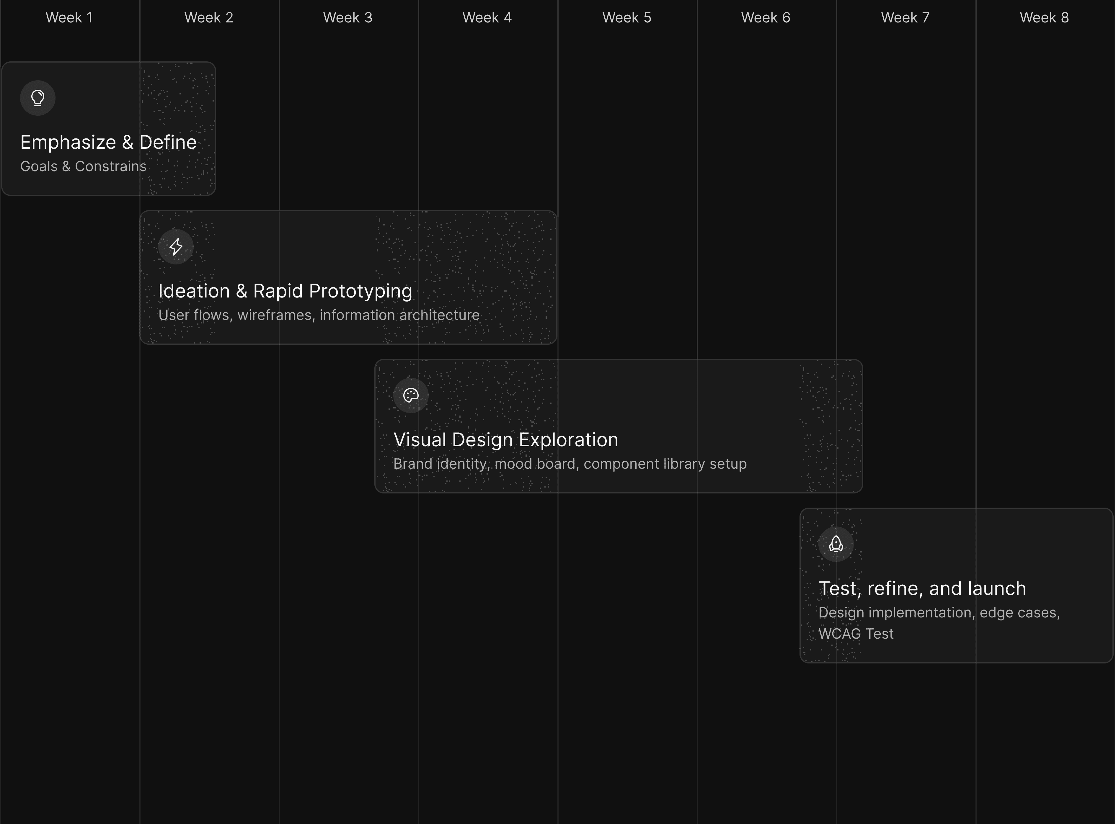
Project process within timeline
IMAGE
The card component's backdrop was a nod to the hero section's animation — featuring the Solara emblem (bgAurora) as a background fill against a foreground layer (before). When hovering, the opacity of foreground color decrease and Solara emblem eases out (Figure 3.3).
3.3
Component Backdrop Logic
IMAGE
The iconic visual pattern
I collaborated closely with SWE to design and implement a card component hover motion concept, representative of sunrise (Figure 3.4).
By only adjusting fundamental opacity and colour properties, the animation was lightweight and implementable purely with CSS transform.
3.4
Component Hover Effect Concept
VIDEO
Visual Design
Stellar look, professional feeling.
Seek Solara's visual identity
Inspired by current website (Figure 3.1) and astronaut image (Figure 3.2), I transformed original toy-like spatial gadgets into hyper-realistic animation of the hero section.
3.1
Before/After Homepage Hero Section
INTERACTIVE
3.2
Inspiration for Homepage Hero Section
INTERACTIVE
The card component's backdrop was a nod to the hero section's animation — featuring the Solara emblem (bgAurora) as a background fill against a foreground layer (before). When hovering, the opacity of foreground color decrease and Solara emblem eases out (Figure 3.3).
3.3
Component Backdrop Logic
IMAGE
The iconic visual pattern
I collaborated closely with SWE to design and implement a card component hover motion concept, representative of sunrise (Figure 3.4).
By only adjusting fundamental opacity and colour properties, the animation was lightweight and implementable purely with CSS transform.
3.4
Component Hover Effect Concept
VIDEO
Link
Want to take an in-depth look at my design files? I prepared a sneak peak file for you.
Design Validation
Stellar look, professional feeling.
Seek Solara's visual identity
Inspired by current website (Figure 3.1) and astronaut image (Figure 3.2), I transformed original toy-like spatial gadgets into hyper-realistic animation of the hero section.
3.1
Before/After Homepage Hero Section
INTERACTIVE
3.2
Inspiration for Homepage Hero Section
INTERACTIVE
The card component's backdrop was a nod to the hero section's animation — featuring the Solara emblem (bgAurora) as a background fill against a foreground layer (before). When hovering, the opacity of foreground color decrease and Solara emblem eases out (Figure 3.3).
3.3
Component Backdrop Logic
IMAGE
The iconic visual pattern
I collaborated closely with SWE to design and implement a card component hover motion concept, representative of sunrise (Figure 3.4).
By only adjusting fundamental opacity and colour properties, the animation was lightweight and implementable purely with CSS transform.
3.4
Component Hover Effect Concept
VIDEO
Retrospective
Collaboration is key.
All outlined OKRs of Q1 were successfully achieved.
An API reference documentation design prototype was presented at an all-hands by the end of Q1 and was well-received. Stakeholders are flattered by the result (figure 10.1).
The team really wanted to start building it. And it's estimated to led to a 68% Increase of sign-ups in Q4, 2024.
Besides, WCAG 2.1 AA compliance across all CTAs and core information.
10.1
Testimonials From Colleagues
IMAGE


